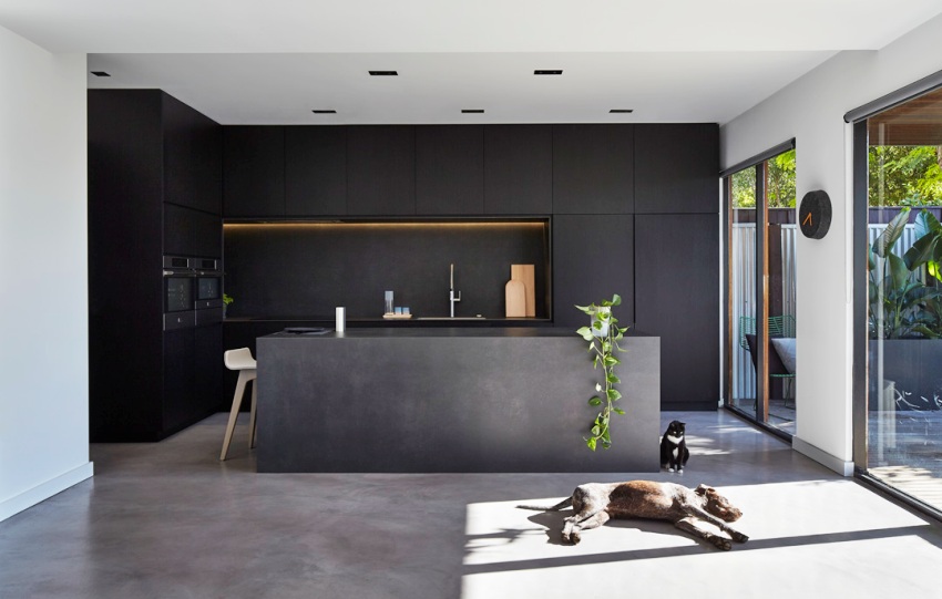
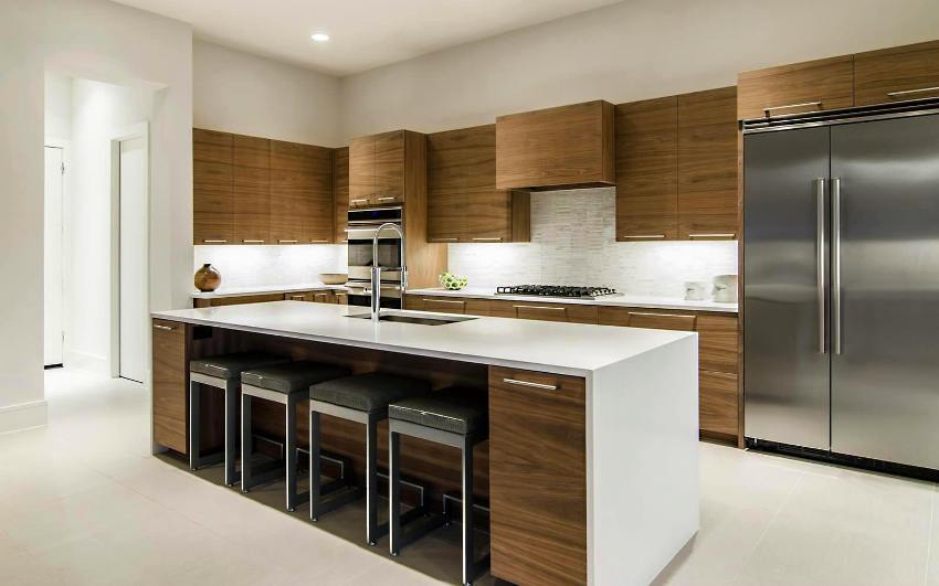
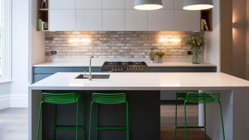
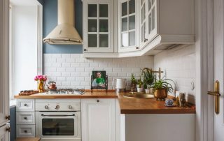
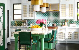
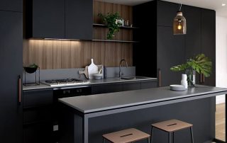
Modern interior designs give everyone the opportunity to experiment with organizing space and create a comfortable environment. A minimalist kitchen involves placing a minimum number of pieces of furniture and decorative elements. The main features of the style are functionality and practicality, this concerns the selection of furniture and equipment. Designers claim that the minimalist style is perfect for relaxing after a working day.
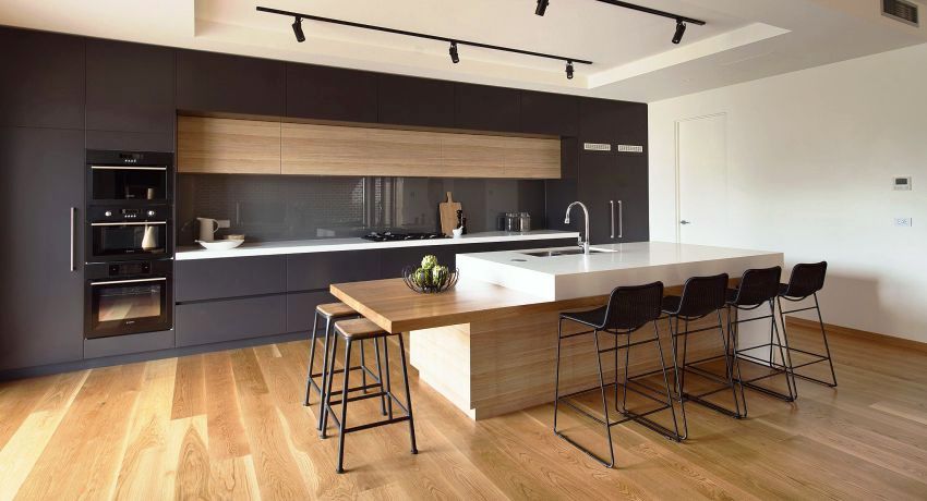
Design kitchen in the style of minimalism is distinguished by simplicity, practicality and functionality
Content [Hide]
- 1 Characteristic features of the minimalism style in the interior
- 2 The basics of planning a small and large kitchen design minimalism
- 3 How to choose the right colors and perform lighting in the interior in the style of minimalism: photo
- 4 How to choose the right kitchen furniture with minimalism interior
Characteristic features of the minimalism style in the interior
Basically, the interior of rooms in the style of minimalism is chosen by active people living in large cities who surround themselves with only the necessary things. The direction itself developed during the formation of modernism, so the styles have some similar features. The advantage of minimalism is the absence of rigid frames and standards, therefore, when decorating an interior, the designer has the opportunity to show imagination and add unique features.
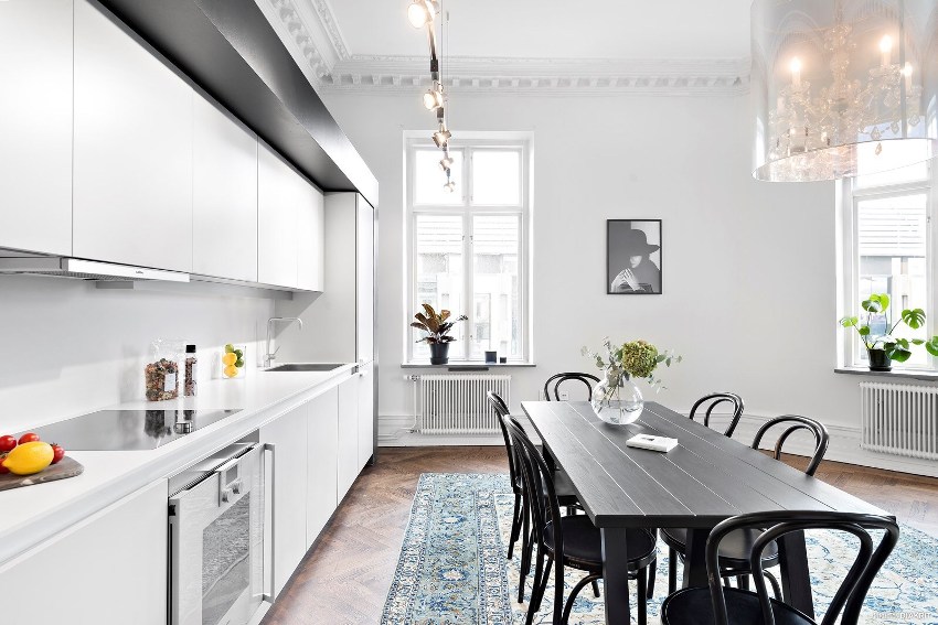
The functionality of all elements is the main feature kitchen interior in the style of minimalism
It is interesting! The basics of minimalism in the interior of the kitchen can be reproduced not only in the conditions of combined spaces - design techniques for decorating a room help to visually make any, even the smallest, kitchen more voluminous.
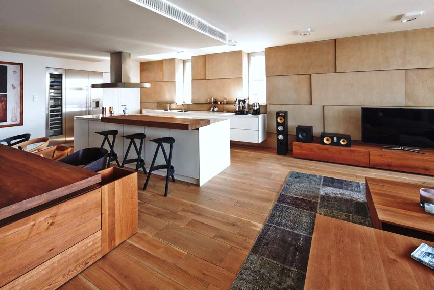
If you look at the photos of the interiors in the style of minimalism, then you can pay attention that the minimum amount of furniture is used when arranging the kitchen. The decor is either completely absent, or 1-2 elements are present. Other characteristics of minimalism include:
- the use of furniture and decor, which are distinguished by the correctness of geometric shapes and laconicism;
- the use of no more than three basic colors in interior design, which are complemented by several bright accents;
- using only built-in technology;
- the presence of a large amount of artificial and natural lighting.
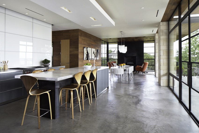
Kitchen interier in a minimalist style, it assumes only built-in household appliances
Thus, while recreating the minimalism kitchen design, several main tasks are required: to expand the volume of the room visually and functionally, while saturating the kitchen with light as much as possible. And you also need to fill the room with built-in storage systems, surfaces for work. Thinking over the design, you should try to keep the dining and work areas as empty and spacious as possible. That is why the direction is considered ideal both when decorating a combined kitchen-living room in the style of minimalism, and a narrow small room.
If we compare the direction with other styles, it should be understood that minimalism lacks the usual elegance of the classics, there is no feeling of habitability, which is characteristic of the Provence and country genres. In the photo of interiors in the style of minimalism, it is impossible to find the variety of colors that characterize fusion or ethnicity. There is no place for an abundance of textiles, decorative elements or complex finishes.
The main difference between minimalism and other styles is that all kitchen items should be located as accessible as possible so that working in the kitchen and cleaning does not take much time.
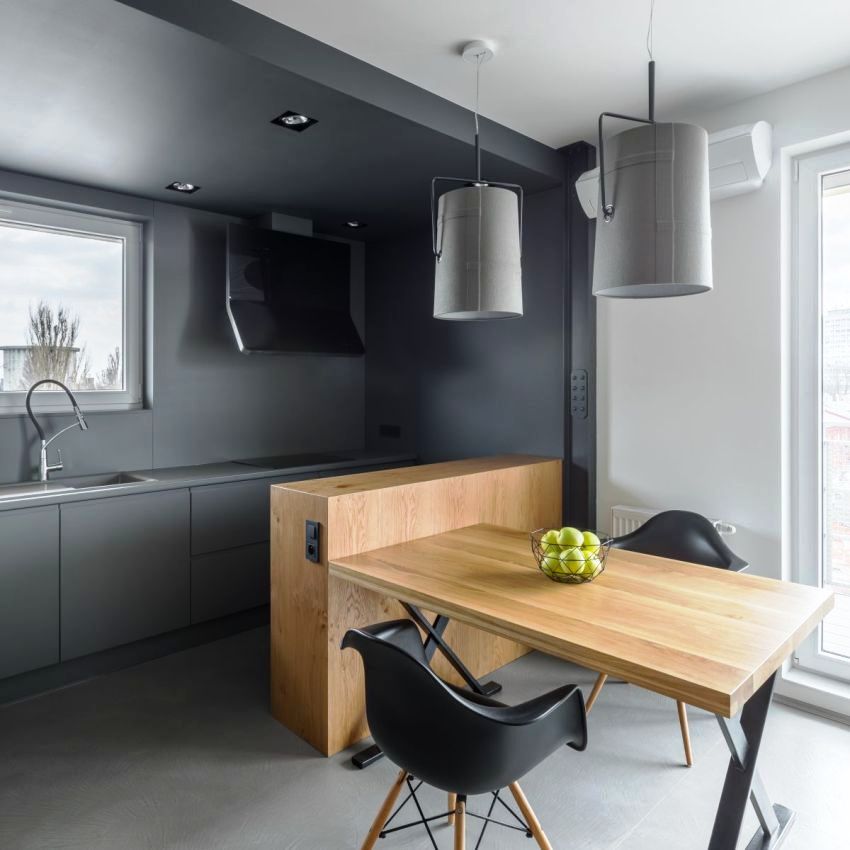
In a minimalist kitchen, there are a maximum of 3 primary colors, most often these are neutral basic shades.
Features of repair and decoration of the kitchen minimalism
When decorating a large or small kitchen in the minimalist style, it must be borne in mind that the room should not look pompous, architectural excesses are not welcome here. The main goal pursued by minimalism is to create a unified concept of space using simple solutions. Elements and building materials should be as simple as possible, but at the same time functional.
Important! Ceramic tiles are considered the most relevant material in the design of the kitchen space.
In wall decoration, preference is given to plain wallpaper or panels; decorative plaster or paint is also suitable for this purpose. It is not recommended to use bright and saturated colors, preference is given to cold shades. Color accenting is best done with furniture elements. When choosing materials, one should take into account their durability and ease of maintenance. An interesting technique is considered when various textures are used for wall cladding. There are other characteristic features of surface design.
When finishing the floor, it is recommended to use stone or ceramic tiles without ornaments or patterns. Less commonly, porcelain stoneware or linoleum coating is used, because such materials are unstable to mechanical stress and quickly lose their attractive appearance. To recreate eco-minimalism in the interior, the use of natural boards, parquet or laminate, made in light colors, is allowed. It is recommended to plan in advance the insulation of the floor, especially if tiles have been chosen as the floor covering.
The ceiling in the design of the kitchen in the style of minimalism is advised to be decorated in light colors. The most classic option is considered to be a white ceiling, usually stretch or painted. A popular design solution is the use of shades of gray, beige or sand. It is important that the surface is perfectly smooth. Both matte and glossy finishes are considered suitable. If the apartment has high ceilings, then by using two-level plasterboard structures, zoning is performed, separating the living room from the working area.
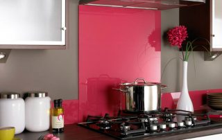
When describing the kitchen style minimalism special attention should be paid to the design features of the kitchen apron. The element should stand out a little, as a result of which it is an effective touch in the kitchen.A beautiful plain tile is suitable here, but the most convenient to use is a panel made of tempered glass, which makes it easy to clean up dirt.
The basics of planning a small and large kitchen design minimalism
The correct layout of the space is the basis for creating a comfortable space. When starting the development of a kitchen project, you should consider the ergonomics of the kitchen set in order to determine the storage space for kitchen small things and utensils. The main steps for organizing kitchen layouts of various sizes:
- determine the parameters of the room, find out what shape the kitchen will be: square, rectangular, irregular, with built-in niches;
- accurately calculate the area;
- depict the placement of window and door openings on the plan, think in advance which doors can be discarded;
- find out the location of water and sewer pipes, sockets and electrical cables;
- find out the plumbing line.
Advice! To make the kitchen comfortable for work and for eating, the layout should be thought out in advance - before starting repairs or even before choosing a home, if possible.
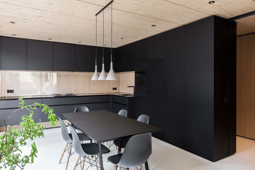
The minimalism style is suitable for small kitchens, because in a small room there is no place for massive furniture and unnecessary accessories
It is important to correctly determine the direction of the working area. It should be noted that the refrigerator must open towards the countertop. It is necessary that the lockers do not overlap each other when opening. The sink cannot be located close to the hob or refrigerator. After all the nuances have been taken into account, you can begin to arrange the kitchen equipment. Among the most popular planning methods are the following:
- Linear. Used in a kitchen that has a small area for two people.
- Corner. It belongs to the most versatile options that look good in almost all kitchens.
- Double row. The optimal solution for narrow and elongated kitchens with a window located at the end of the room. In this case, the furniture set is installed along the longest wall, and the dining area is taken out to the window.
- U-shaped. Suitable for large studio kitchens or spacious kitchens in country houses. Various options for arranging furniture are possible here, but it is better to prepare a plan in advance so as not to oversaturate the space.
- Island. It is considered a good solution for medium to large kitchens (at least 20 square meters).
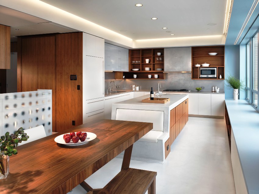
With the correct arrangement of furniture in a minimalist style, space is freed up and the kitchen area visually expands
Minimalist kitchen: correct zoning of space
If the apartment is characterized by a small area, then in order to increase the space, they try to remove the curtain walls and unnecessary partitions as much as possible in order to free up the room for decorating the kitchen-living room. In this case, furniture is most often used for zoning a room. The soft corner, turned back towards the working area, will well separate the area intended for rest. Better to give preference to wide rectangular seats with low backs.
Upholstery sofa should be plain, in a contrasting color against the walls. It is also better to give the advantage to a transforming sofa, which, if necessary, will create additional sleeping places for guests.
A popular zoning element is considered to be an open rack, on which a minimum amount of decor is placed, or a false wall with built-in shelves. If space permits, a bar counter or a kitchen island is ideal for this purpose.In the conditions of creating Japanese minimalism, the border between the zones is made using a screen, a movable or stationary partition, as well as a light curtain. As in other modern interior styles, properly organized lighting acts as a means of differentiation in minimalism, which separately highlights the working and dining areas, as well as the recreation area.
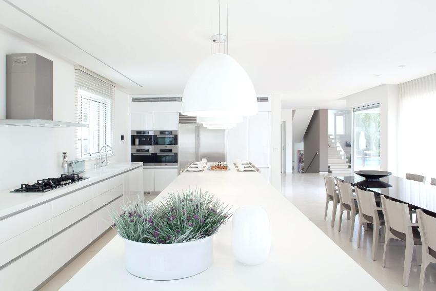
The minimalism style in the interior of the kitchen allows you to equip the dining room from the living room, and you can zone with the help of light and color
How to choose the right colors and perform lighting in the interior in the style of minimalism: photo
If a decision is made to recreate minimalism in the interior of a house or apartment, then you should give preference to classic and calm shades. The most popular colors used for minimalist interiors include:
- white;
- grey;
- beige;
- red;
- brown;
- the black.
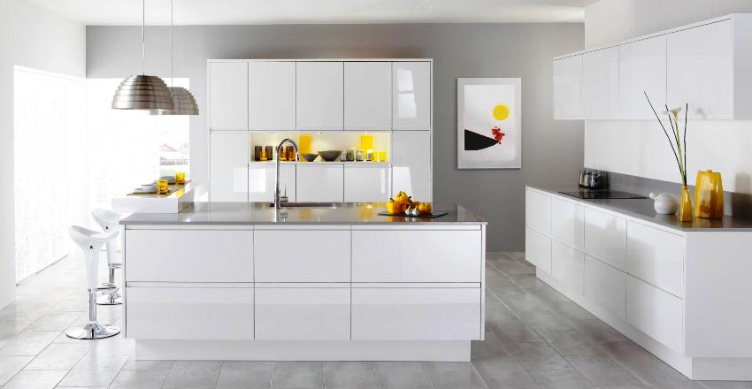
Looking through photos showing examples of kitchen designs, you can see that bright accents are not used in the interior and more than three tones are not used. The most successful and classic solution is monochrome white kitchenI'm in the style of minimalism. Firstly, white surfaces reflect light as much as possible, and secondly, they visually increase the volume of space. An original option is considered where the bottom of the work cabinets is made in coffee tones, and the top, like the surrounding walls, is made light. It is especially important to use this technique when decorating a small room.
Useful advice! If the kitchen has window openings, it is advised to use a variety of blinds or roman blinds for their design. In order not to obstruct the penetration of light, the windows can be beautifully covered with light and transparent curtains in pastel colors.
When choosing lamps for a modern interior in the style of minimalism, it is advised to give preference to correct geometric shapes, with the help of which the light is evenly distributed throughout the room.
Related article:
Loft-style kitchen: ideas for creating industrial laconicism in the interior
Selection of finishing materials, furniture and equipment. Lighting as an important component of style.
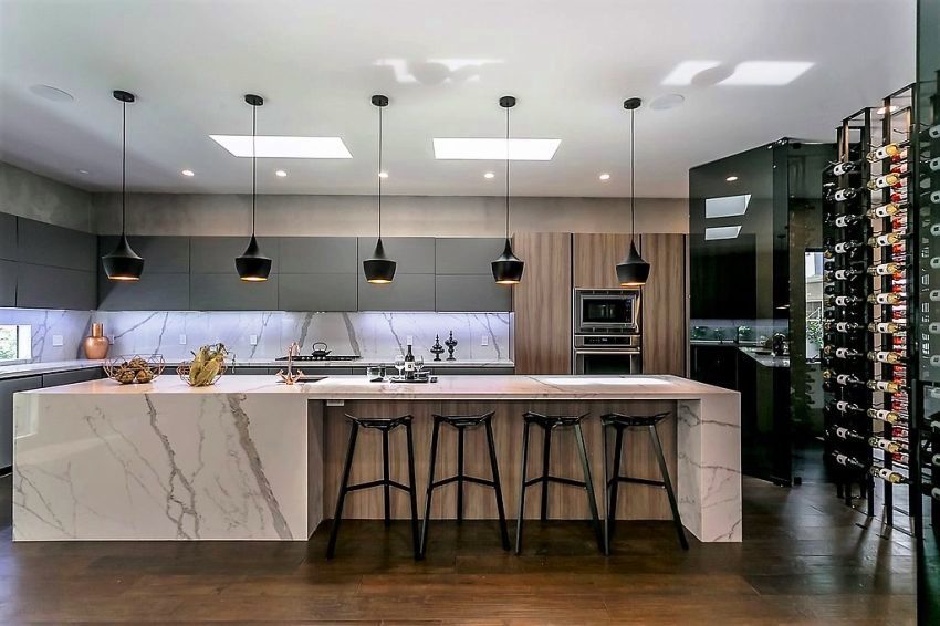
The most popular are chrome, plastic or glass shades. The basis is made up of central lighting, for which either one large chandelier or a composition of several small lamps are suitable. Usually, such light is located above the dining table when decorating a combined kitchen and living room interior, minimalism or to highlight the working area. Other lighting options include:
- perimeter ceiling lighting and light panels mounted in kitchen cabinets;
- spot lighting and wall sconces;
- hidden illumination of kitchen appliances and spotlights.
In the photo of kitchens in the style of minimalism or eco-minimalism, you can often see wooden lamps or metal products. It is allowed to hang a large number of lamps, because lighting is considered an important element of interior decoration, but the devices should fit beautifully into the overall environment. The use of unusual design shades is also encouraged.
How to choose the right kitchen furniture with minimalism interior
Kitchen furniture, first of all, should differ in functionality. Beautiful mirror fittings, properly organized filling of cabinets and pedestals compensate for a certain severity and brevity of the minimalism style. In this case, the interior of the room looks stylish and original.
If there is a niche in the kitchen, then usually the headset is symmetrically built into it flush with the wall.The interiors of kitchens made in the style of minimalism (the photo clearly confirms this) presuppose the presence of cabinets-cases in which a variety of household appliances are placed - usually an oven, microwave or a small refrigerator, mini-bar.
Facade surfaces are recommended to choose flat and solid colors. If minimalism is being recreated in the interior of a small apartment, then it is better to choose glossy surfaces of facades without any applications or drawings that visually expand the small area of the kitchen. Preference is given to hidden handles made of aluminum profile or milled.
It is interesting! Instead of handles for cupboards, a special "push-to-open" door opening system is used, which is especially important in a small kitchen, where any protruding element can cause injury.
When choosing the material from which the work area is made, the budget is considered the main determining factor. The most economical material is laminated chipboard, which is faced with plastic or acrylic. Kitchen furniture made of MDF will cost a little more - a material that is closest to natural and is considered more environmentally friendly compared to chipboard. They do not recommend spending money and purchasing natural wood furniture. Although if the budget allows and the interior tends to eco-minimalism, then this option is quite acceptable.
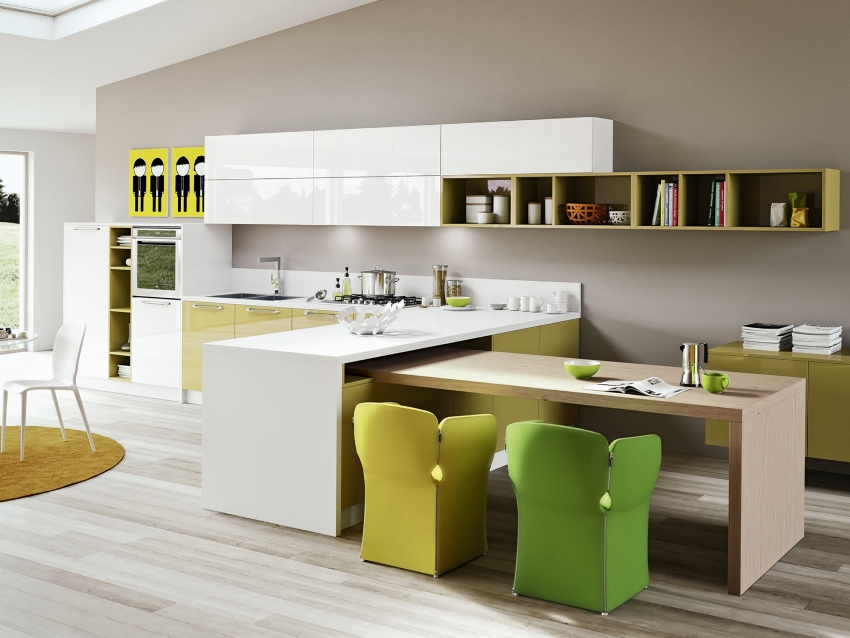
Furniture for the kitchen in the style of minimalism is characterized by convenience and functionality
The color of the facades can match the color of the walls or be in contrast to it. The best option is considered to be the design of the kitchen using white glossy facades. As numerous photos indicate, minimalism in the interior of the living room-kitchen provides for the possibility of zoning the space using the color of the furniture. It should be borne in mind that the tabletop in this case acts as an accent element and is made in a contrasting color. Therefore, if preference is given to light facades, the tabletop should be much darker.
Apron design, selection of equipment, table and decor for the kitchen in the style of minimalism: photos of interiors
An apron is considered an item that can effectively dilute a monochrome design. The best solution for decorating an apron is the use of ceramic tiles or durable tempered glass. A kitchen in which the headset, apron and countertop are made of materials with a similar texture and shade will look good. The most popular pattern is imitating natural stone.
If glass is chosen as the material for the apron, then both a colorless version and a brightly colored one will look good, but in any case the presence of a pattern or ornament is unacceptable. If tiles are chosen for finishing, preference should be given to large elements to minimize the number of seams, which are considered to be accumulators of dirt.
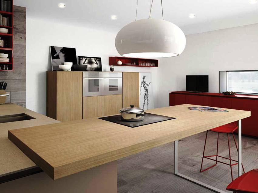
Household appliances in a minimalist kitchen must be built-in. This applies to both large household appliances (refrigerator, oven, microwave) and small electrical appliances, which include juicer, coffee maker, multicooker and others. Thanks to the built-in technology, the surface of the countertop is freed from unnecessary items. The cooker hood can be placed in a cabinet or left open. At the same time, it is necessary that the open hood blends harmoniously with the kitchen design.
A minimalist kitchen interior can be diluted with a few decorative details. The most popular decorative elements include:
- unusual vases;
- original chandeliers or wall sconces;
- stylish fruit stands;
- bottle holders.
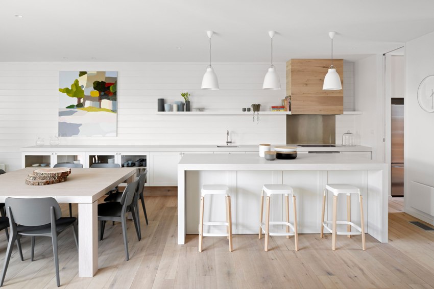
You can revive the strict style of minimalism with an unusual vase, stand, picture or an original chandelier
It is interesting! The decoration of the house will be a kitchen-living room with a fireplace in the style of minimalism, which will play the role of a central element in the recreation area and fill the room with family comfort.
Bright colors can be added by placing several indoor plants in regular-shaped metal pots. Beautiful plants will help unobtrusively make color accents and dilute the plastic monochrome design. You can complement the interior by placing succulents, chlorophytum, aspidistra, and even just green grass. Another option for decorating a space is to hang pictures in the style of minimalism, the color and image of which are in harmony with the environment.
Japanese minimalism in the interior of the kitchen is complemented by natural wood boxes and fans. A distinctive feature of this trend is the presence of small trees (bonsai), arranged in a certain order and in small numbers.
How to choose a table for the kitchen in the style of minimalism in the interior of the apartment: photo
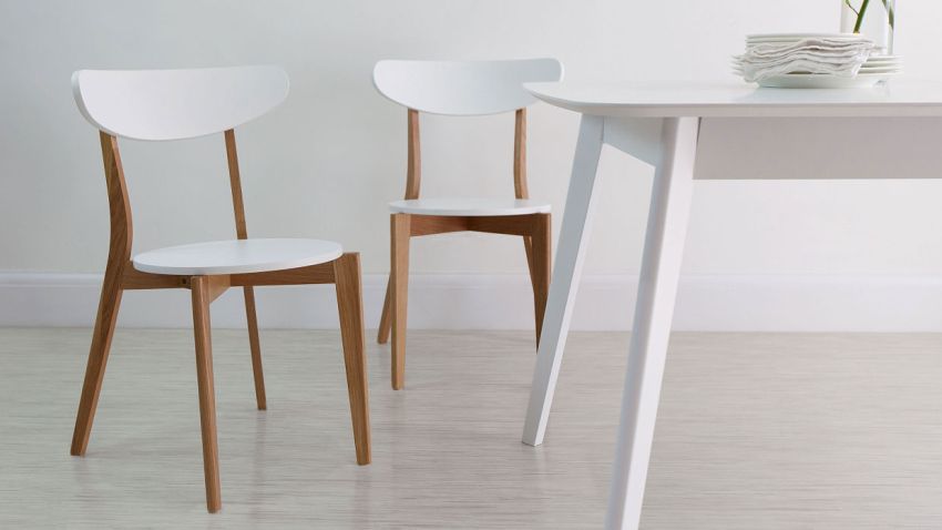
When choosing a dining group, preference is given to a strict minimalist design. The dining table top should be round, rectangular or square. It should be noted that for decorating a small kitchen, it is better to purchase a rounded countertop without corners in order to reduce the risk of injury. It is desirable that the legs are located under the central part of the table, which gives additional legroom and allows you to expand the circle of guests.
Useful advice! With limited space, it is better to give preference to a transforming table. In the case of a very small kitchen, you can use a wide window sill as this piece of furniture, or purchase a folding table.
A wooden or glass surface looks original, as well as a veneered MDF tabletop. When choosing a table, you should focus on the general concept of kitchen design. Therefore, it is quite acceptable to install a plastic table, which is complemented by chrome elements, or a table made of natural wood, made in a simple style, without paintings and curly cutting. In most cases, in a small space, a transparent dining group is considered a winning option, which, as it were, dissolves in space and does not clutter up a small area.
A kitchen decorated in the style of minimalism, first of all, assumes restraint and severity of lines. In such a design, there is no place for things that are not useful or are inconvenient. The main thing is to observe harmony when choosing textured materials and adhere to clear geometric shapes. A large part of the space should be left empty, so that you can easily and quickly prepare dinner and not spend a lot of time cleaning.
