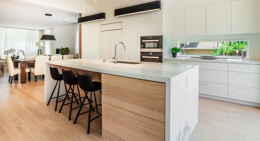
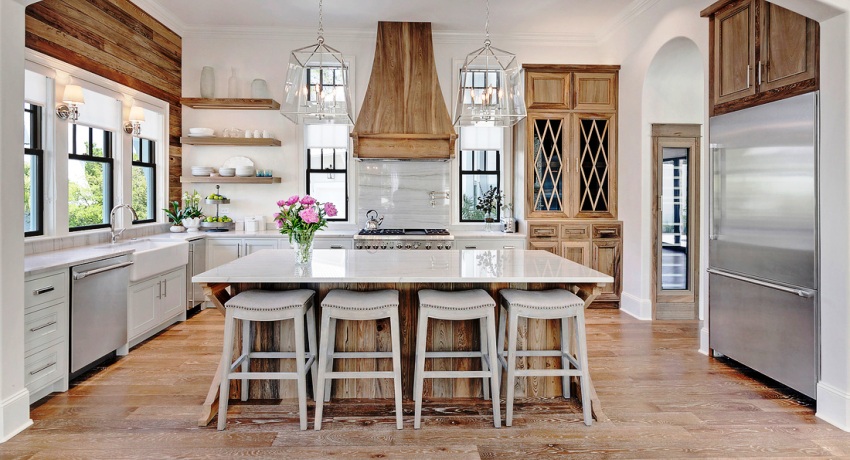
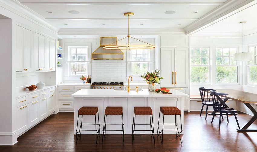
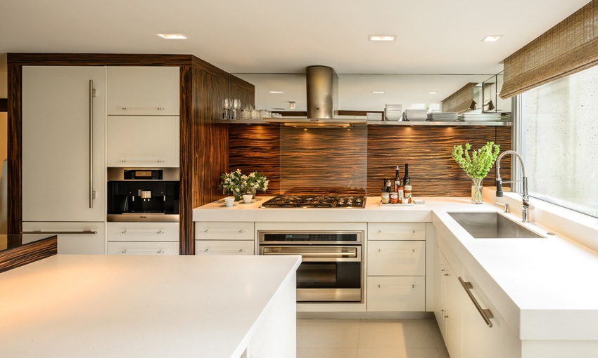
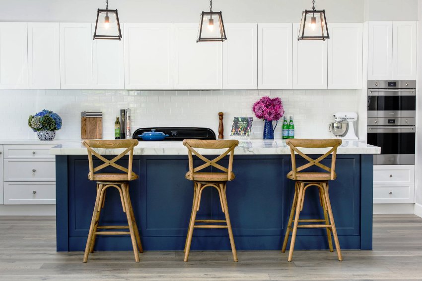
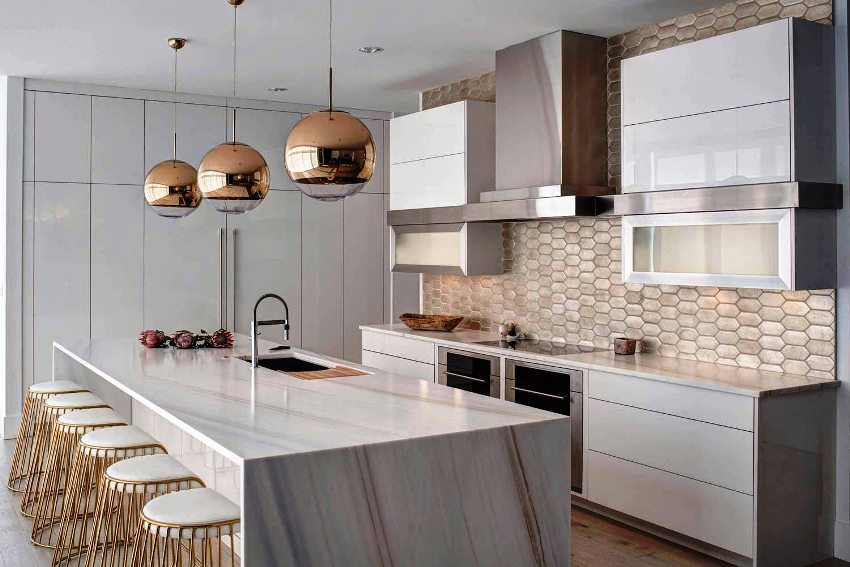
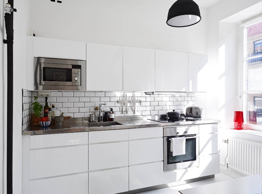
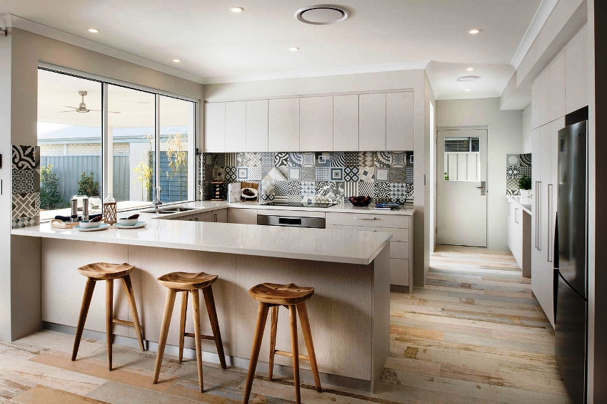
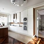
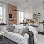
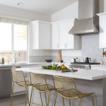
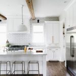
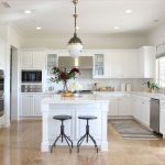
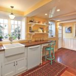
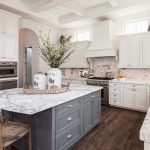
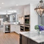
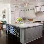
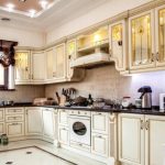
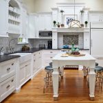
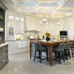
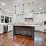
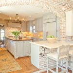
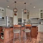
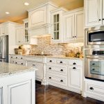
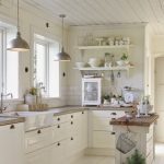
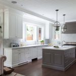
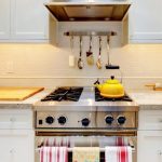
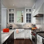
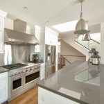
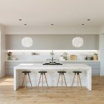
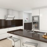
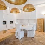
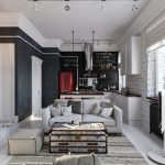
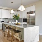
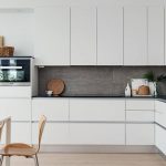
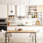
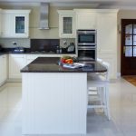
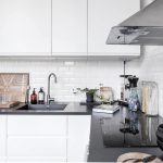
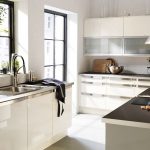
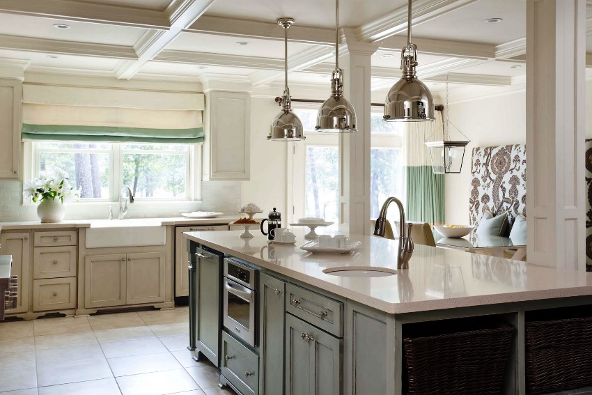
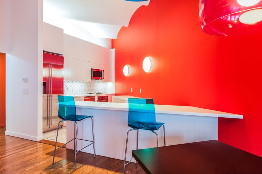
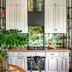
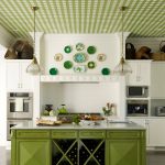
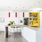
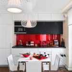
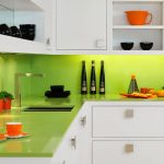
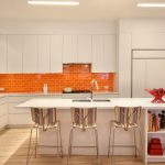
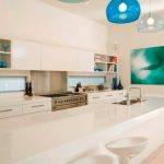
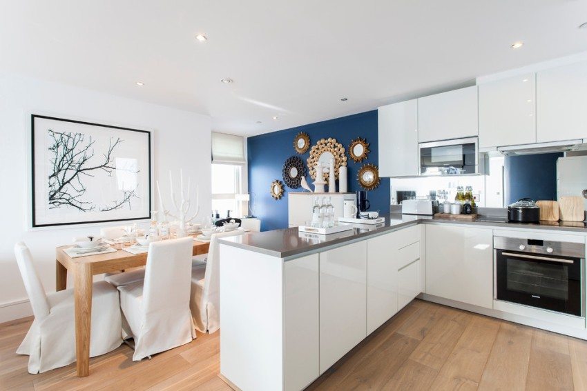
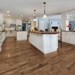
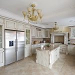
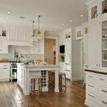
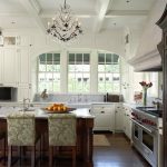
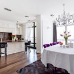
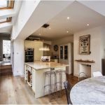
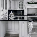
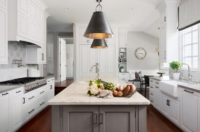
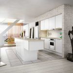
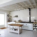
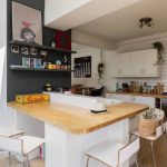
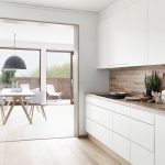
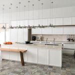
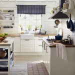
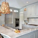
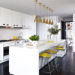
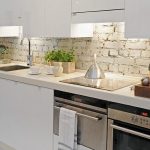
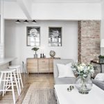
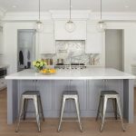
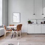
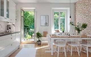
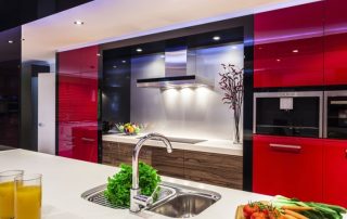
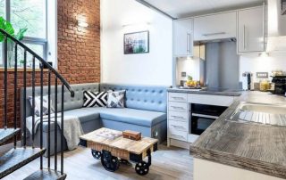
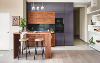
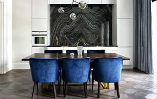
The most popular design option for kitchens is white. It brings purity and lightness, visually expands the space, perfectly reflects light, and creates a positive mood. At the same time, excessive whiteness requires special care and makes the interior sterile. Therefore, you need to first study how a beautiful and cozy white kitchen looks like: photos of various design options and tips contained in the article will help you create the perfect design.
Content [Hide]
- 1 Features and benefits of a white kitchen in the interior: photos of design examples
- 2 The main disadvantages of a white kitchen in the interior
- 3 White glossy kitchen: design features
- 4 Matt white kitchen: design and decor for every taste
- 5 White kitchen: a classic that never goes out of style
- 6 White kitchens in a modern style: photos of various options
- 7 Neoclassicism as a modern interpretation of tradition in the design of white kitchens
- 8 Unrivaled and fashionable white kitchen: photos of current designs
Features and Benefits white kitchen in the interior: photo design examples
Classic white is a simple and neutral color that does the best job of visually expanding space. In addition, it reflects light perfectly. By opting for white in your kitchen design, you can be sure that such a decision will help raise your spirits and create the inspiration you need to cook the most delicious dishes. In the interior style, it has long been believed that a kitchen in white is a win-win option from both a decorative and a practical point of view due to a number of advantages:
- on a white background, dust, soap stains, water marks and limescale are less noticeable, white facades are considered less easily soiled. This color is much more practical than black, blue and other dark shades;
- white color visually expands the space. Therefore, this option is an ideal solution for a small kitchen. Real photos of white kitchens in the interior of Khrushchev, where, it would seem, the situation with regard to the lack of space is hopeless, clearly demonstrate this;
- white color contributes to the creation of a visual image of lightness and grace. Any cabinet or table feels less heavy and bulky;
- natural lighting on a white background becomes more saturated, since such surfaces reflect light well;
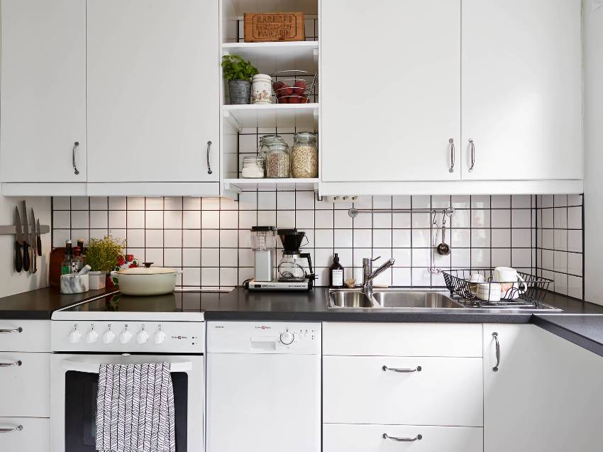
White kitchen perfectly meets modern trends striving for minimalism
- To balance the pretentious and elegant interior design in a classic style, white is best to help. Such an interior will acquire features of grace and elegance;
- white is considered the king of colors due to its versatility, as it can be combined with all sorts of shades and looks great in kitchen interiors made in different styles.
Main disadvantages white kitchen in the interior
On pure white surfaces, especially glossy ones, dirt is very noticeable. Therefore, in order to keep the room impeccably clean, you will have to wash such a kitchen quite often. However, if you approach the right choice of finishing materials, then you can easily avoid such difficulties, and cleaning will become easy and fast. Particular attention must be paid to the flooring: the material must be durable and moisture resistant.
Helpful advice! The practicality of light surfaces depends on the quality and texture of the materials. Therefore, it is necessary to thoroughly approach their choice. For example, it is much easier to clean washable wallpaper than paintable wallpaper or decorative tiles with a textured pattern.
At the same time, an overabundance of white in an interior can create a sense of sterile cleanliness, which is associated with a hospital atmosphere. This problem is solved with the help of accessories of different colors and small bright accents in the interior. Two-tone kitchens look especially harmonious, where contrasting tones are used in combination with classic white.
A white kitchen definitely requires special care, but at the same time it creates a great mood and inspires cleaning. In addition, white color is able to add noble notes to the interior even when using inexpensive materials and pieces of furniture. It is quite simple to choose white furnishings and finishing materials. They are always on sale. Therefore, it is relatively easy to create the most varied white kitchen designs. Photos, which are presented in sufficient numbers on the Internet, clearly demonstrate this.
White glossy kitchen: design features
Kitchen sets and kitchen finishes with a glossy finish are now at their peak. Their surface is distinguished by radiant whiteness, nobility and showiness. Even professional photos of a glossy white kitchen are not able to fully betray their beauty. Such surfaces perfectly reflect light, creating a play of sunlight, and contribute to the visual increase in space.
Furniture with snow-white glossy facades will always look elegant and stylish, regardless of the chosen style direction. This choice is especially relevant for modern, high-tech, Scandinavian or country kitchens. The main thing is to successfully choose decor items using design tricks so that the kitchen does not look monochrome, but becomes refined and interesting.
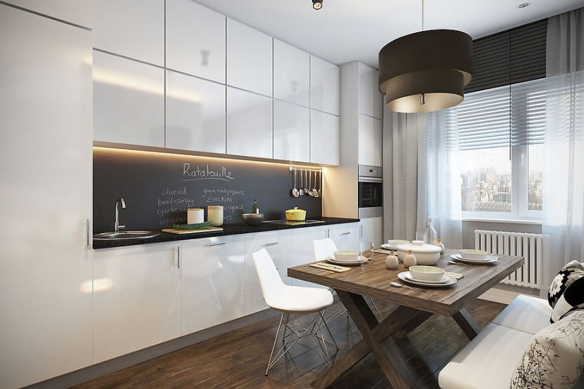
These can be multilevel reliefs, surfaces with different textures, or the addition of white with other colors and shades. It is from the facades of the headset that they now often begin to develop the overall design of a snow-white kitchen. Such glossy white kitchens in a modern style embody the features of minimalism, differ in functionality and emphasize the technological design:
- facades made of chipboard or MDF, with a plastic coating, which are based on modern acrylic, are resistant to various external influences in the form of high humidity and temperature fluctuations;
- on glossy facades, handles are replaced with special opening mechanisms, so the headset is made in a single plane, which creates the effect of merging with the walls;
- The glossy white surface is particularly effective at expanding the space and reflecting light.
The combination of the white gloss of the kitchen with other decor elements
The most popular options for glossy kitchens are facades with perfect flat or curved surfaces, not burdened with unnecessary decor. As a supplement, a small amount of bright or, conversely, inconspicuous details are used. Photos of a glossy white kitchen in the interior show examples of interior design.
Helpful advice! Gloss white kitchens are a great way to visually expand small kitchens and add light to north-facing rooms.
Traditional finishes combined with glossy furnishings are rare. Most often blinds are used here instead of curtains, and ceramic tiles are used only on the floor, with the exception of imitation of a brick wall on an apron with the help of tiles.
Special attention is paid to the design of the apron. He sets the mood for the entire working area, it depends on him what the room will be: embodying simplicity and genius or creating a futuristic riddle. A great option for an apron is glass surfaces (skins), which will help to realize any ideas. They often contain landscapes of nature or a city at night, images of colorful birds, fruits, or even portraits.
Related article:
The combination of colors in the interior of the kitchen: we create a stylish and harmonious space
How to harmoniously combine shades in a room. Choice of color for walls, cabinet fronts, furniture and accessories. Examples of well-designed kitchens.
For the dining area in such kitchens, models with chrome-plated or white-painted metal legs are selected. The seats are often made of flexible plastic or covered in white faux leather. The table top of the dining table is most often glass, which goes well with the white gloss of the kitchen. Photos clearly demonstrate this.
White matte kitchen: design and decor for every taste
If glossy facades are mainly chosen for kitchens made in modern styles, then matte kitchens are more suitable for decorating rooms in a classic and ethnic style, in particular in chebbi-chic, modern or Provence styles. Interesting solutions are used here in the form of volumetric decor, openwork elements or graceful handles. Most often these are solid wood kitchens that emphasize the character and features of a particular style, creating a favorable climate in the house.
The combination of finishing materials in such kitchens resembles modern interiors, where bright accessories and accents are present, or harmony with a range of neutral pastel colors is created. For a matte kitchen, the following features are characteristic:
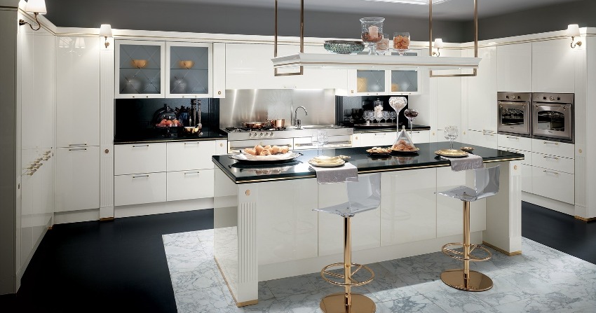
- Matte products in the classic interior of a white kitchen are often performed with a gilded finish, which gives the room a solemnity and severity. Curtains, dining room items and accessories can be either white or gilded.
- An apron in classical styles is decorated with ceramic tiles, mostly in white with a pattern or ornament - in country and Provence, terracotta color is permissible. Skinali are also suitable, but provided that they have rustic plots applied to them. Natural motives can be depicted on the Art Nouveau apron.
- Facade fittings in such headsets should have an ornate shape that attracts attention.
- If the walls and furniture in the kitchens are snow-white, then the floor should be brown, which will emphasize the naturalness of matte facades.
Helpful advice! Kitchen cabinets in a classic interior should reach the ceiling even if the top shelves are not accessible. The upper part of the facades is decorated with ceiling cornices. This technique will give a majestic look to the entire room.
White kitchen: classicnot going out of style
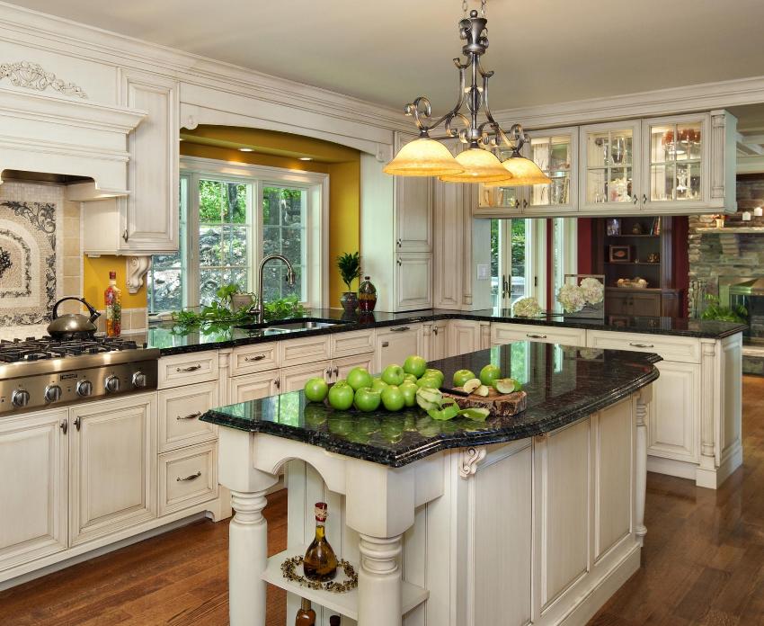
The classic style has remained relevant for many centuries. It is preferred by people who value tradition, elegance and order in everything. Most often, the classics are chosen for the design of spacious kitchens of country cottages. The style is characterized by restraint combined with grace, the interior is distinguished by symmetry, laconicism and correct lines. The features of antiquity in the form of columns, portals, characteristic decor in pastel colors, ornaments and other elements are acceptable.
The design of a classic white kitchen starts with a work area that should emphasize centuries of tradition and family values. In such rooms, you can often find direct headsets with an island, which are located next to the dining room. The best option is a magnificent furniture set in the shape of the letter P, in which there is a place for any little things. A white corner kitchen is installed only if the sides of the headset are symmetrical and equal in length.
In classic design, a special place is occupied by details that at first glance do not create an impression. These elements include:
- special portals surrounding the area around the hob and hoods, giving the interior aristocracy and solemnity;
- stylized columns that can be used for zoning a room;
- cornices, moldings and stucco moldings used in decorating walls and ceilings;
- podium-like flooring pattern or ornamental ceramic tiles that outline the kitchen or functional area;
- wrought iron or crystal openwork chandeliers with pretentious decor.
The color palette of a white kitchen: a photo of examples of a successful combination in the interior
A monochrome design, even in a classic style with white in the lead role, will look boring and sterile, so you can't do without additional colors. First of all, you should pay attention to the golden hue. It is used in decoration and decoration - for painting moldings, stucco elements on the ceiling or as accessories.
Pastel colors will perfectly complement the classic white interior, acting as the main background in the decoration of walls, ceilings or furniture in the living room, if we are talking about a single room. Pastel colors are more typical for neoclassicism, pure classics are snow-white walls and ceilings. The decor elements may contain different shades of natural stone, which will perfectly fit into the classics of a white kitchen. Photos show options for interior decoration with imitation of natural stone on the countertop or on the floor.
Helpful advice! When decorating classic kitchens in the main white color, it is allowed to use other shades that will help get rid of sterility and bring zest to the interior.
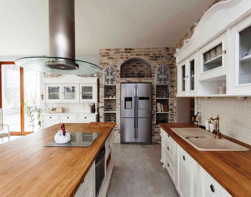
Brown also fits perfectly into the interior of a white classic kitchen. The photos show the harmonious combination of wood countertops and snow-white facades. Yellow and terracotta colors, as well as their shades, can also become an addition to a white kitchen.They are used as a background for finishing an apron to complement the golden shades, less often as the main background of the walls. Red and burgundy colors are acceptable in a white kitchen, but only on the condition that the room is spacious.
White kitchens in a modern style: photo variety of options
In both classic and modern styles, white is used not only when choosing furniture, but also when decorating walls and ceilings. Bright walls are practically not used in such interiors. As an exception (to create an accent), part of the wall in the dining area and the apron can be decorated in other colors. At the same time, the color and pattern are selected according to the modern style in the kitchen in white.
Wallpaper should be chosen in such a way that they blend harmoniously into the design. Walls can be decorated with paint, plaster or plastic panels. They should have a minimum of drawings - it is better in some one place, for example, on a wall that is accent. The use of bright colors is allowed in the apron area. The design of ceilings can be traditional (using plaster), and modern options are also used in the form of stretch canvases or plastic panels.
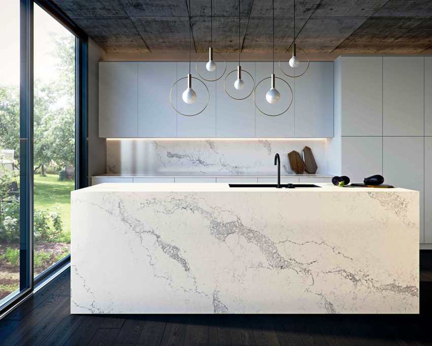
In the interior of the kitchen in a modern style with white furniture, it is better to give preference to simple lines and laconic forms.
When decorating the floor, it must be remembered that this surfaces should not only be practical, but also set the mood for the whole room. If the bottom is dark, then attention will be focused on furniture and a variety of details, including handles and curtains. A light floor, on the contrary, attracts attention to itself, so you should choose the best and harmonious option. Practical in the kitchen will be moisture-resistant tiles, linoleum, deck boards, as well as special wear-resistant laminate.
White kitchen design: creating accents and selecting details
You can't ignore the details when creating a modern white kitchen design. Photos, of which there are many on the network, indicate such a need. The following points deserve special attention:
- when choosing direct headsets, you need to focus on the apron, using bright skins for its decoration or brick-like tiles, if we are talking about the loft style;
- a bright accent on the apron should not be done if there is a corner white kitchen in the room: the photos show an excellent combination of facades with traditional tiles, on which a discreet pattern is applied;
- in modern white kitchens, a combination of white facades with dark-colored household appliances is appropriate, but provided that there are other design details of the same color in the interior: curtains, wall decoration or furniture in the dining area, as well as utensils and even part of the facades, but exclusively headset at the bottom.
Helpful advice! If a decision is made to purchase a headset of a combined type (in terms of color), then the upper part must be necessarily white, and the facades at the bottom must be of any other tone, because any color is perfectly combined with white.
In the design of a kitchen in white, even in an ultra-modern style, extraordinary and original solutions are not very appropriate. For example, when decorating a kitchen in a high-tech stylistic direction, pink curtains are unlikely to fit, and modern blinds are unlikely to fit into modern style. After all, the manifestation of individuality and fantasy requires a sense of proportion. Therefore, banal tiles, matte facades and simple plain wallpaper may well become the most optimal and win-win option for creating a harmonious interior.
Neoclassicism as a modern interpretation of tradition in the design of white kitchens
The “new” classic is an excellent choice for those who hesitate between modern and classic kitchen design. In this design, kitchens in white have retained the traditional features inherent in the solemn and majestic classicism and at the same time acquired new outlines, details and mood inherent in modern trends.
The following basic features are characteristic of neoclassicism:
- classic lines and shapes without the presence of antique ideas and objects that are characteristic of old interiors;
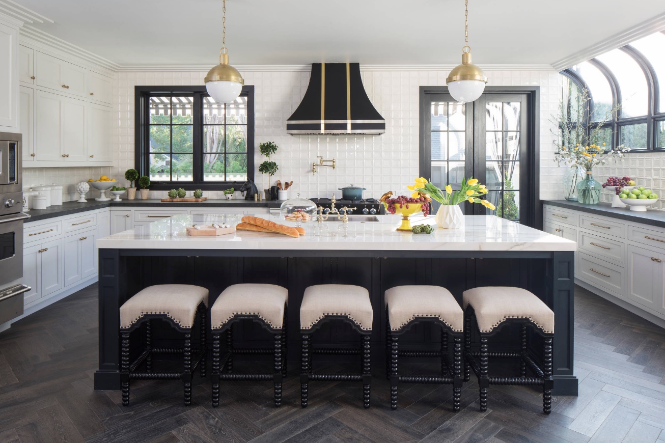
To maintain the rigor of neoclassical design in the design of kitchens, it is better to give preference to white.
- simplicity of design, but with the obligatory predominance of natural materials in furniture and decoration, the absence of synthetics and plastic;
- full automation of the kitchen with the presence of the entire arsenal of modern technology, which should harmoniously fit into the interior design.
Neoclassicism seems less majestic than the traditional classical style. Symmetry, strict geometry of forms, combined with functionality and laconicism - all this is present in the interior of the white kitchen. Photos testify to this. The main difference between the new classics and the traditional ones is the use of new furniture in the kitchen, excluding rare and aged items, as well as the availability of a richer color palette.
Unrivaled and fashionable white kitchen: photos of current designs
White kitchens in the interior have remained in trend for several decades. At the same time, they not only do not lose their popularity, but, on the contrary, acquire new features, picking up the latest fashion trends in interior design. With the advent of new styles, designers add novelties, ideas and accessories to the design that only improve the classic white kitchen, but in no way spoil it.
The emergence of new building and finishing materials also contributes to the creation of the original design of the white kitchen. The photos that have appeared on the Internet recently show such a variety.
In almost any style design, involving the use of a variety of furniture and household appliances, such a kitchen was and remains the most interesting option. It will take a lot of time and effort to take care of it, but these costs will be fully offset by a number of positive emotions caused by being in the "white space".
Helpful advice! White kitchens can be decorated in different styles. Most often, designers choose modern, scandi, provence, high-tech, loft, minimalism, country, provence and classicism. This range is possible due to the versatility of white, as well as its ability to harmonize with other colors and shades.
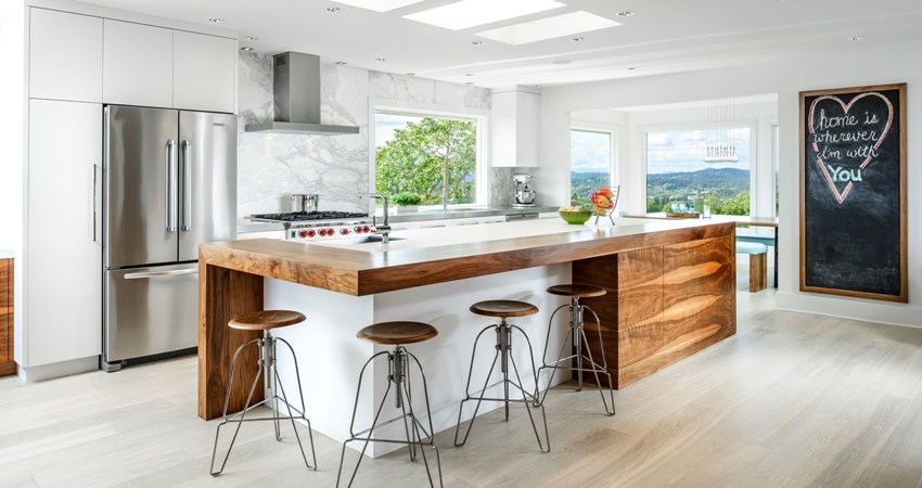
For a white kitchen, you can easily select kitchen appliances and other utensils, since in any case they will fit well into the interior
The small white kitchen is especially popular. The room not only looks attractive, but is also filled with additional light, which is important for darkened and northern apartments. Thanks to its many advantages, the white kitchen will never go out of style, but will be relevant in many styles and in different countries. After all, it is this color that personifies purity and nobility.
