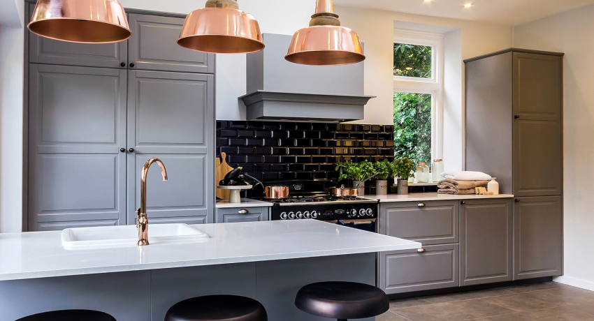
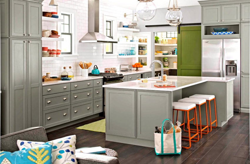
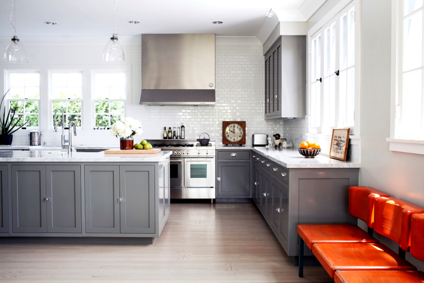
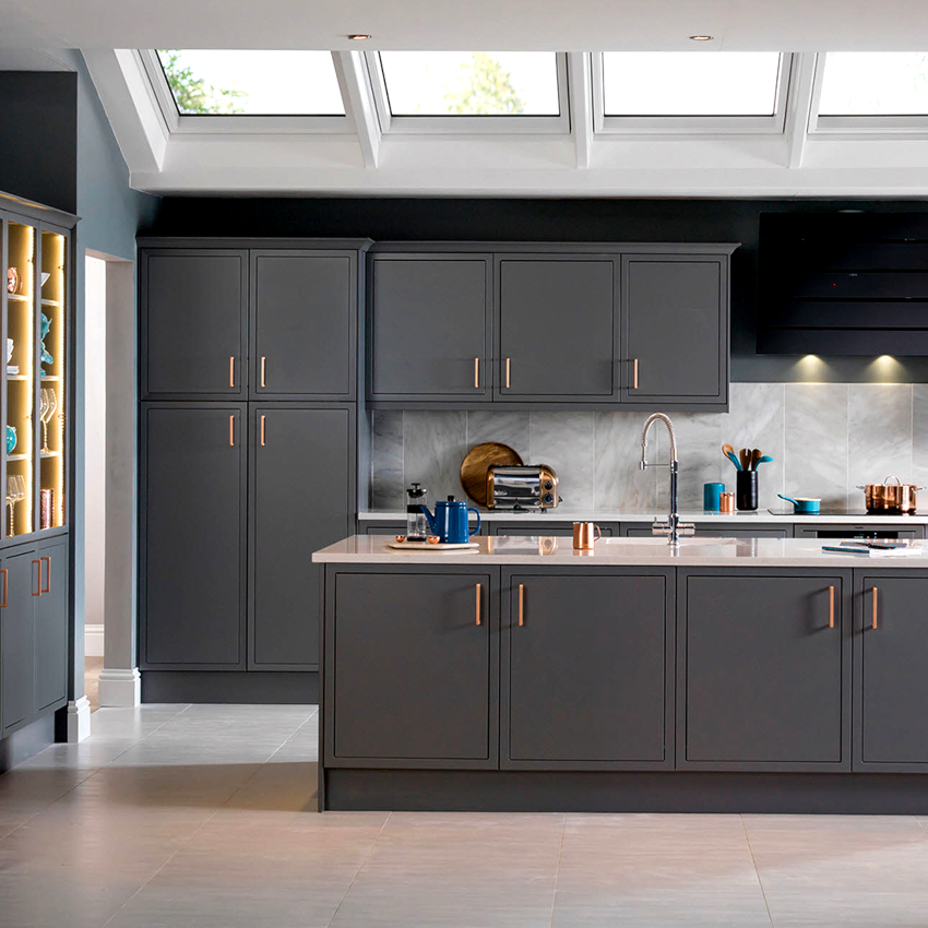
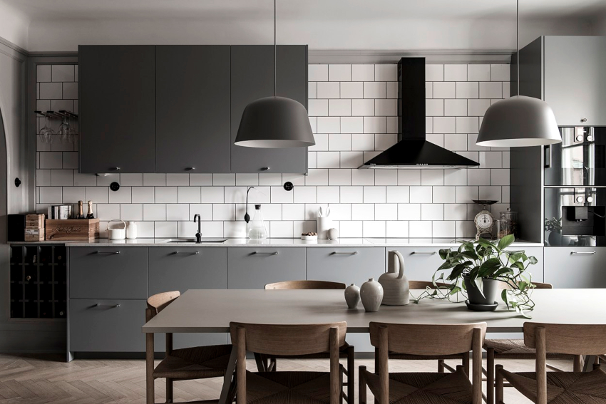
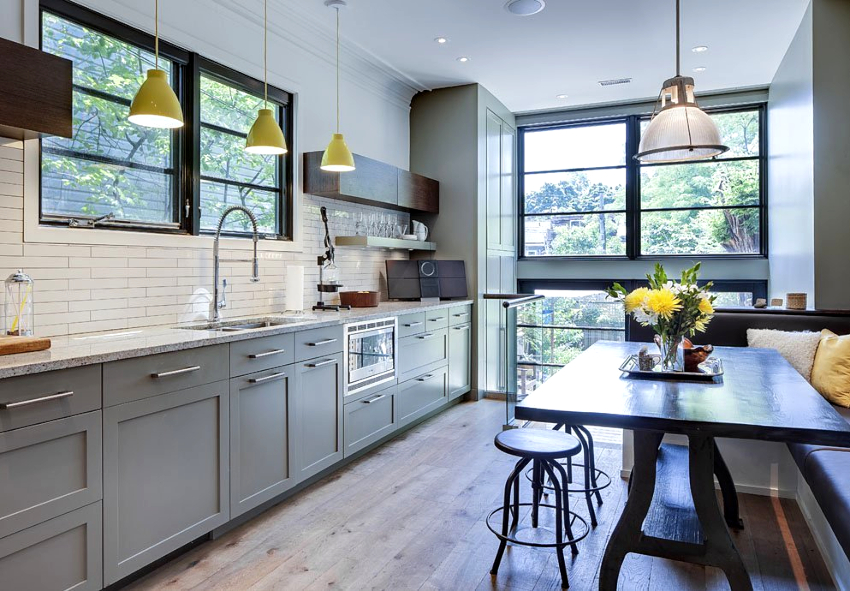
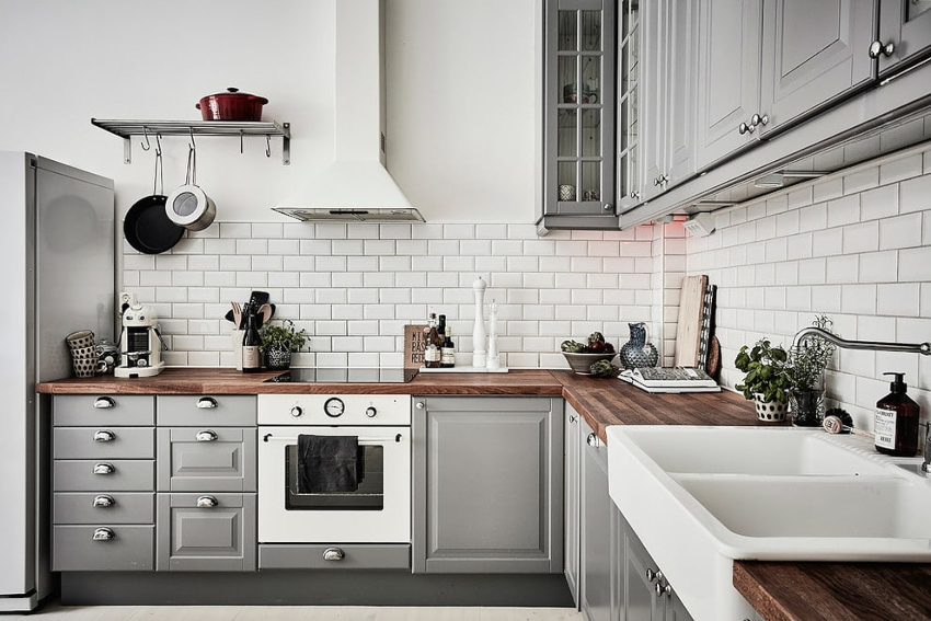
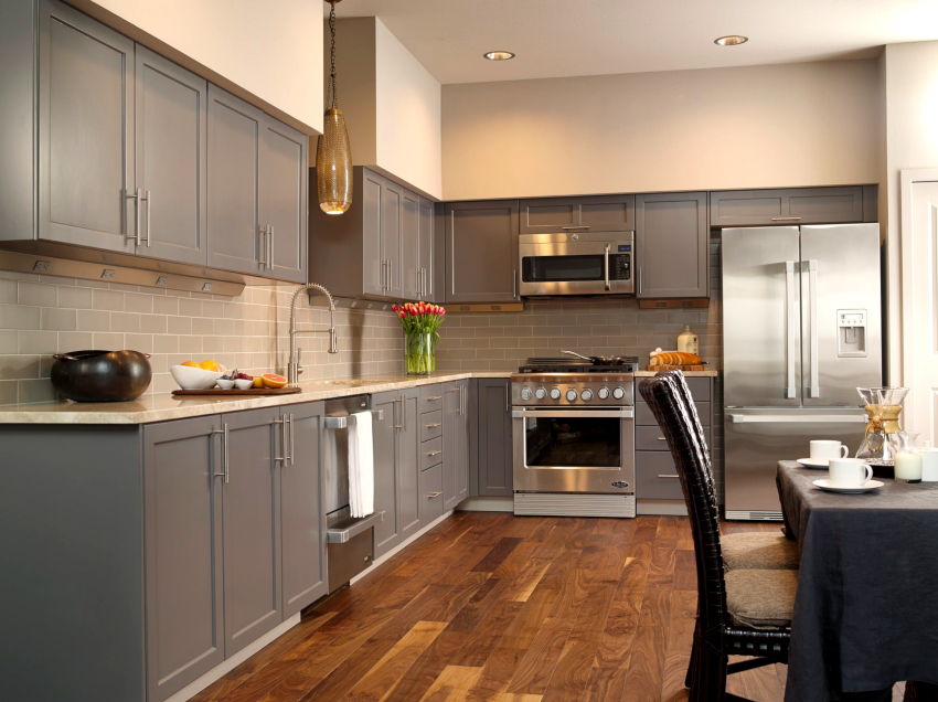
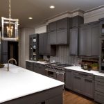
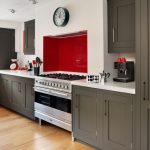
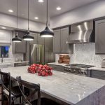
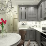
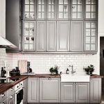
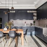
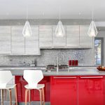
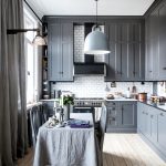
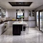
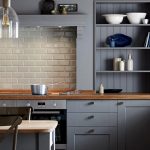
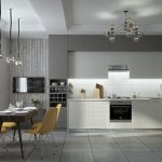
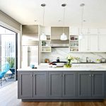
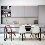
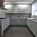
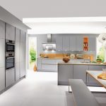
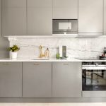
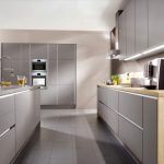
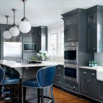
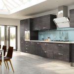
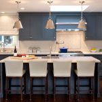
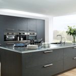
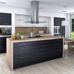
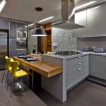
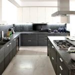
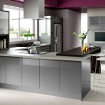
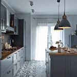
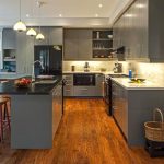
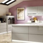
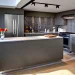
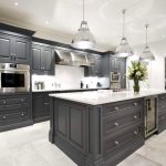
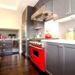
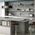
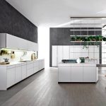
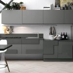
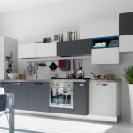
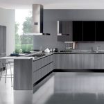
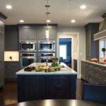
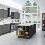
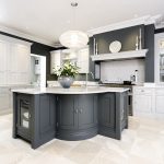
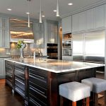
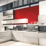
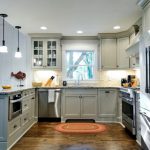
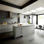
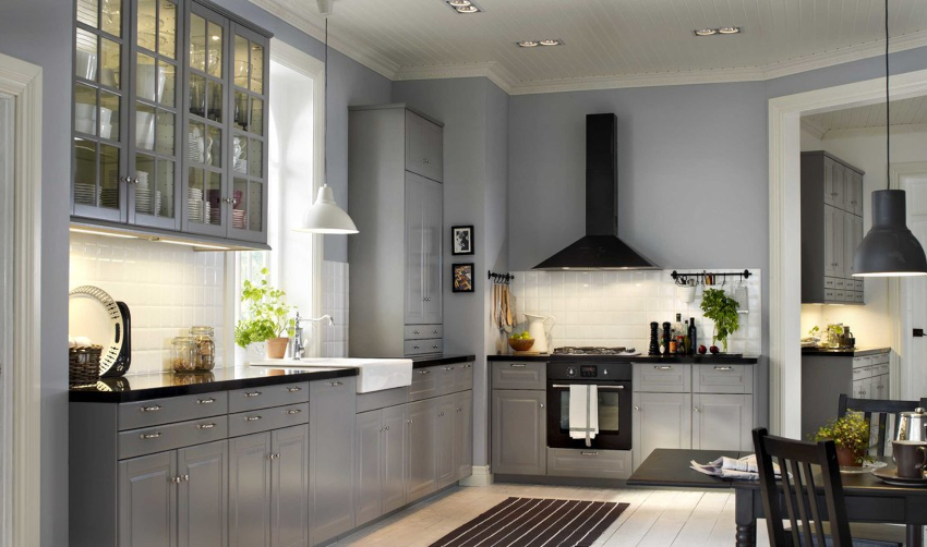
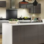
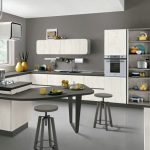
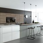
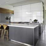
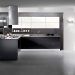
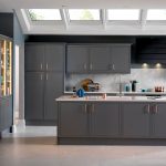
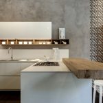
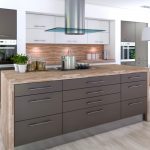
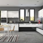
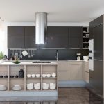
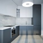
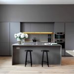
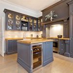
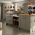
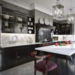
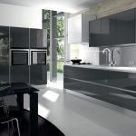
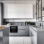
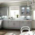
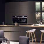
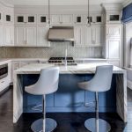
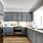
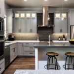
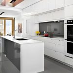
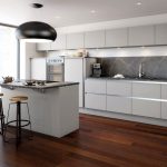
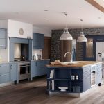
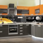
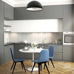
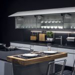
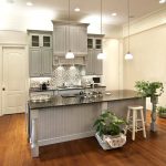
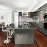
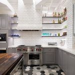
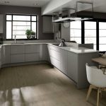
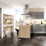
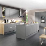
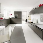
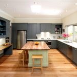
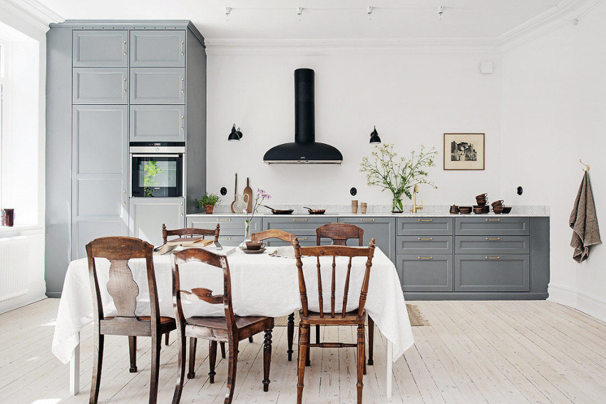
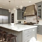
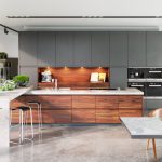
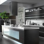
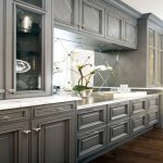
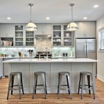
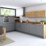
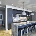
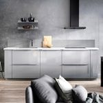
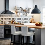
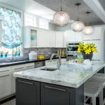
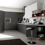
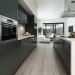
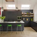
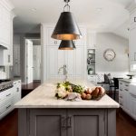
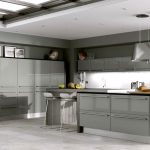
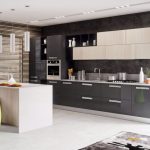
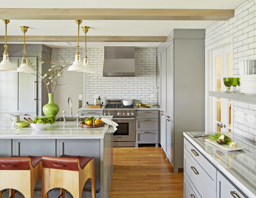
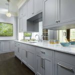
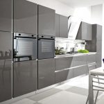
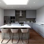
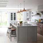
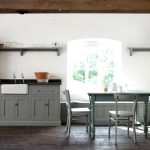
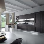
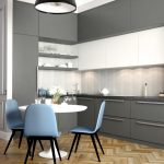
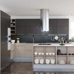
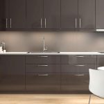
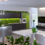
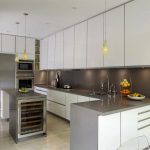
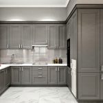
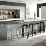
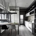
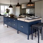
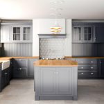
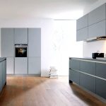
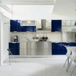
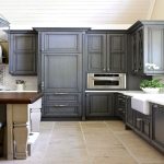
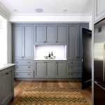
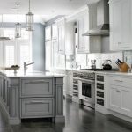
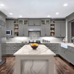
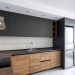
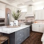
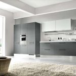
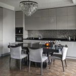
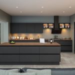
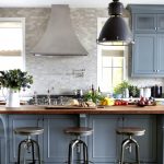
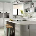
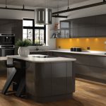
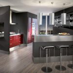
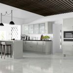
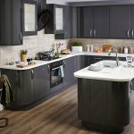
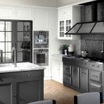
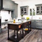
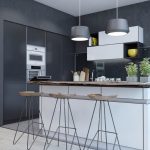
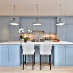
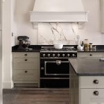
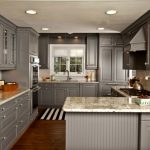
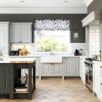
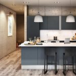
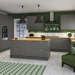
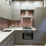
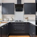
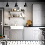
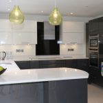
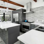
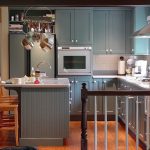
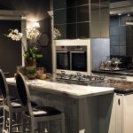
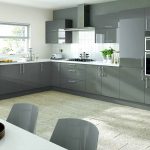
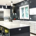
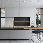
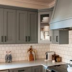
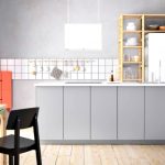
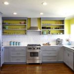
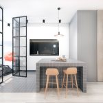
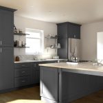
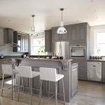
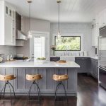
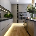
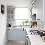
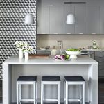
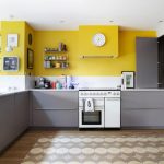
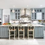
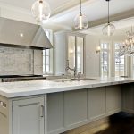
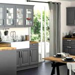
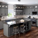
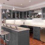
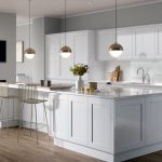
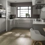
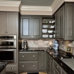
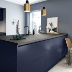
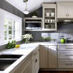
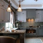
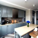
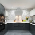
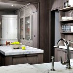
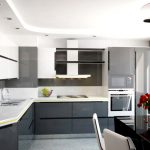
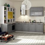
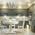
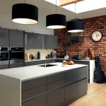
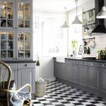
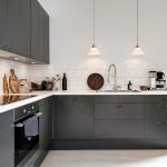
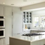
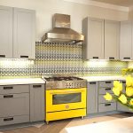
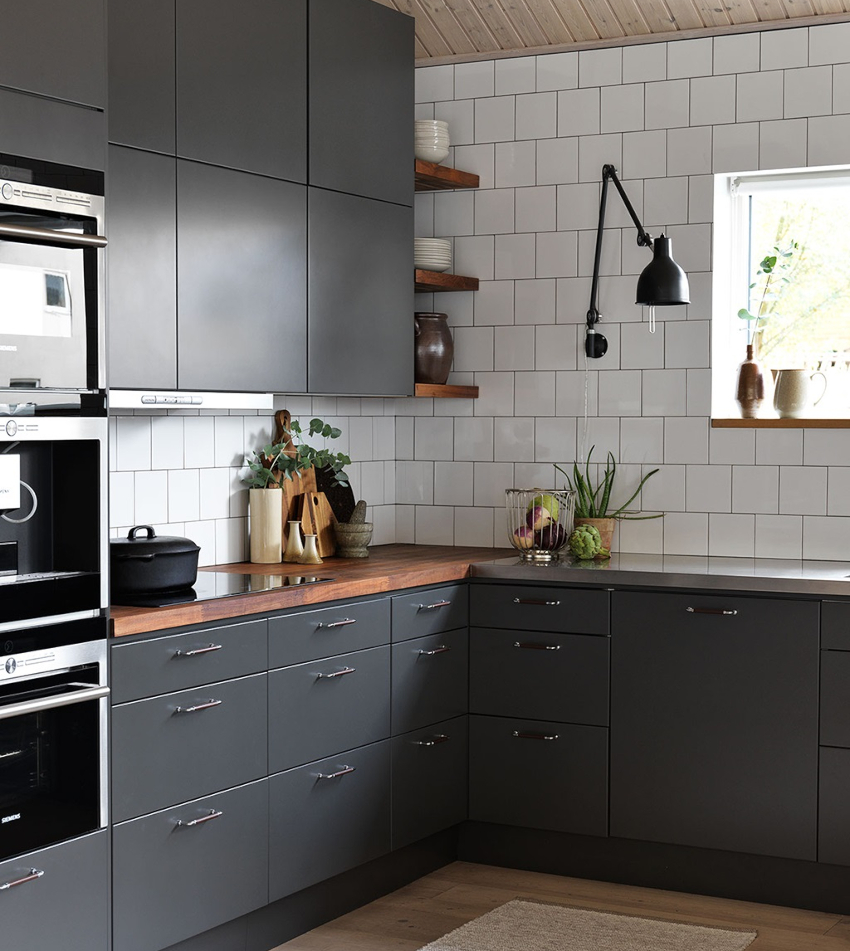
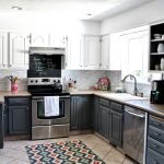
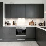
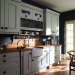
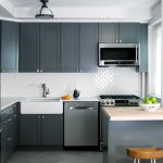
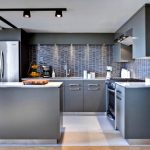
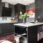
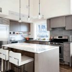
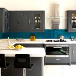
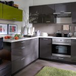
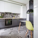
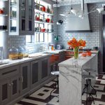
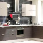
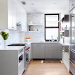
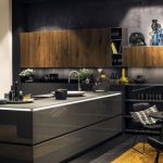
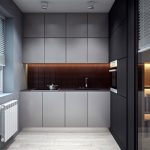
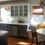
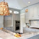
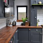
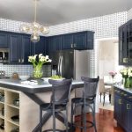
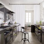
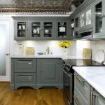
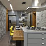
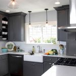
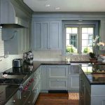
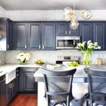
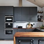
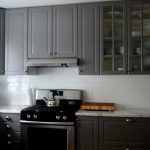
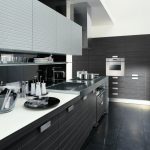
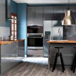
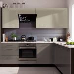
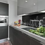
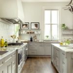
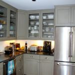
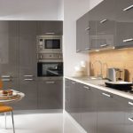
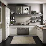
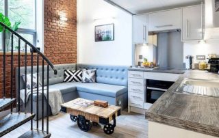
For a long time, gray was considered a boring and gloomy color. Modern interior designers have proven the opposite: they have made gray one of the most popular in the design of rooms, using it as a base. The well-designed gray kitchen looks modern, noble and stylish. Due to the fact that the color has many shades, you can create a neutral interior, which, unlike a bright one, will not quickly get bored.
Content [Hide]
- 1 Why you should decorate the kitchen in shades of gray: opinions "for" and "against"
- 2 Gray kitchen: the choice of materials for surface finishing
- 3 How to choose gray kitchen furniture
- 4 Features of lighting and the choice of accessories for kitchens in gray tones: photos of finished interiors
- 5 What colors are combined with gray in the interior of the kitchen
- 6 Various options for choosing a style: photo of kitchens in gray tones
- 7 How to decorate a small kitchen and adjust the shape of a room: photo of interiors in gray
Why you should decorate the kitchen in shades of gray: opinions "for" and "against"
Combinations of gray in the interior were first used by European designers, because in Russia this color was considered dull and boring for a long time. Rooms decorated in shades of gray were too formal, repulsive in their coolness. Basically, designers associate such negative reviews with the fact that the use of gray is not suitable for all rooms.
So, the use of dark tones of color in low light, indeed, can make a room look gloomy and visually smaller. If you use light colors or organize abundant artificial lighting, then such problems will not arise.
Helpful advice! Indeed, the abundance of gray pigment can cause negative emotions. For this reason, the room uses a combination of gray shades with other colors. Monochrome gray interiors are rare in practice.
A positive feature of the use of gray in the interior is the fact that the color belongs to neutral tones: it is neither warm nor cold. For this reason, shades of gray are not stressful or annoying. Applying the tones correctly is not distracting or depressive. There is an opportunity to combine this color with any other.The advantage is also its own tonal variety of gray, which allows you to get away from monochrome and implement interesting design ideas.
In a gray kitchen, you can favorably highlight the unusual shapes and texture of the kitchen set. The features of the shade allow you to use it without fear in the design of modern interior styles, such as hi-tech, minimalism, loft, art deco, and even use it for interior design in classic, Scandinavian and Provence style. Other benefits of using gray in kitchen design include:
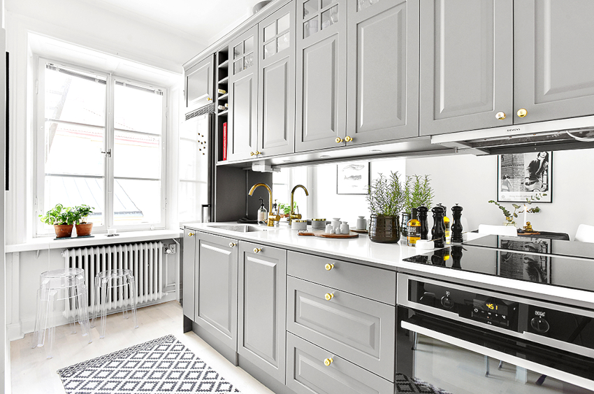
Light shades of gray look good in the interior of a small kitchen, the size of which visually expands
- Neutrality. Accent elements stand out easily against the gray finish.
- Practicality. The gray color does not get dirty quickly, no traces of soot or grease are visible on it.
- Versatility. Light shades of gray look good in the interior of a small kitchen, the volumes of which visually expand, and dark tones can be successfully used in a large room.
- Compatibility. The gray walls of the kitchen are considered an ideal base for furniture with wooden facades, which retain the natural shade and structure. Apart from that, gray goes well with most other colors.
Basic shades that are included in the gray color scheme
Slate, ash, concrete, anthracite or silver - all these shades belong to the gray color scheme. Some of them may be distinguished by the presence of blue tones. By using different color combinations, you can create combination kitchens that apply a variety of effects.
Helpful advice! If you use such a design technique as a gradient color transition on the walls, using a slate color for finishing the lower part of the kitchen, and gray with a pearl tint for the upper part, the height of the low ceiling visually increases.
Gray color is distinguished by a variety of shades, each of which is used in the decoration of the kitchen and occupies a certain place in it. In general, the color scheme is divided into dark and light colors. The following shades are referred to the dark gray scale:
- twilight;
- graphite;
- wet asphalt color;
- steel;
- carbonic;
- silver black.
Designers do not recommend zealous use of dark tones even in a large kitchen, using them only to create accents. If light gray is used, these restrictions do not apply. To create a light gray interior, the following shades are often used:
- concrete;
- granite;
- pebble and lichen color;
- silver metallic;
- ashen;
- smoky gray.
Sometimes even mother-of-pearl is referred to as a gray color scheme. In any case, experts advise not to try to make a monochrome design, but to use gray only to create the basis of the interior.
Gray kitchen: the choice of materials for surface finishing
A gray kitchen design will look especially attractive if you choose the right building materials for renovating the premises. The main thing is to remember that there is a constant temperature drop in the kitchen, and the humidity is often increased. There is always the possibility of dirty stains during cooking and eating. The main characteristics that the materials for the kitchen should differ are:
- wear resistance;
- strength;
- aesthetic appearance;
- ease of care.
Ceramic tiles, parquet boards or laminate are most often chosen as flooring. Of course, linoleum is also suitable for this purpose, but it must be borne in mind that it is quite easy to damage it, especially if you often move furniture. Often in the photo of kitchen finishes, you can see a combination of options, when ceramic tiles are laid in the work area, and a warmer wooden coating is used as the main finish.
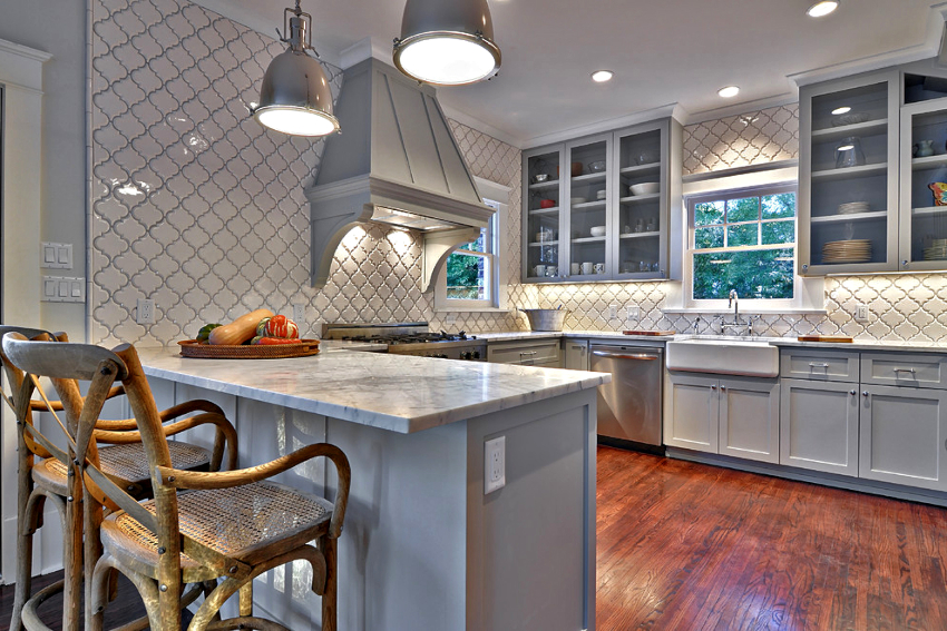
Kitchen design in gray color will look especially attractive if you correctly approach the choice of building materials for renovating the premises.
Since gray color harmoniously combines with any other tones, the color of the coating must be chosen based on the general concept of the room - it can be both a rich and a calmer shade. The smoky-colored coating looks good in the interior. Modern manufacturers produce laminate, linoleum, tiles that successfully imitate wood.
Related article:
Green kitchen: effective, juicy and positive interior
Basic shade options, combination with other colors. How to make the facades of kitchen furniture, arrange an apron.
A variety of materials can be used to complete the wall design in the kitchen:
- ceramic tiles;
- wallpaper;
- brickwork;
- decorative plaster;
- plastic panels.
Often, in the conditions of one room, they resort to a combination of materials, which can be optimally used for zoning a room. Gray walls in the kitchen are considered the most successful option, because it is easy to choose a beautiful interior for such a neutral base, and any color will look harmonious. This design of the walls will be appropriate in a room of any area. Against the background of gray wallpaper in the kitchen, chrome elements on kitchen furniture and modern appliances with silver facades will look good.
Helpful advice! When designing a kitchen in gray tones, it is important to take into account the dimensions of the room: the smaller the parameters, the lighter the wall decoration should be. In a large kitchen, you can use dark flooring, but in a small room, it is better to use light gray tones for flooring.
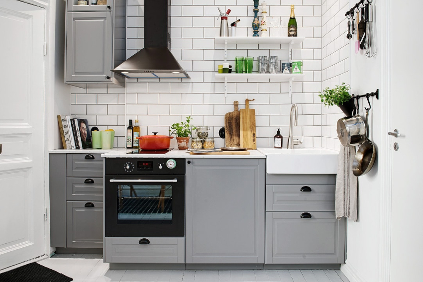
When designing a kitchen in gray tones, it is important to take into account the dimensions of the room: the smaller the parameters, the lighter the wall decoration should be
The choice of ceiling options is quite large. To decorate it, you can resort to ordinary painting or use a stretch canvas, multi-level plasterboard structure, plastic panels, ceiling slats. The most popular option for finishing the ceiling is a combination of a plasterboard structure with a stretch canvas, which allows you to beautifully decorate the surface and embed a large number of lighting elements. In any case, it is recommended to leave the ceiling white in the kitchen. A white ceiling against a background of gray walls will visually appear higher, and the room will be more spacious.
How to choose gray kitchen furniture
When creating a gray kitchen, it is necessary to take into account that furniture and kitchen facades occupy more than half of the area, and it is their color that sets the tone for the entire room and forms the interior image. Using gray furniture in the interior, you can choose both laconic, austere smooth facades and carved wardrobes decorated with exquisite fittings.
It is necessary to select material for furniture taking into account the allocated budget - both wooden and facades made of MDF or plastic panels look equally good. You can also use chipboard products, but such furniture must necessarily have certificates of quality and environmental friendliness, which confirms its safety.
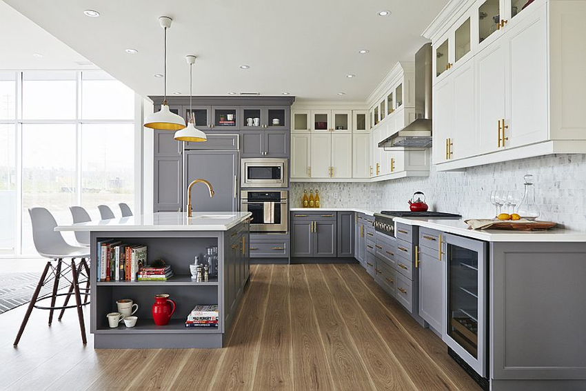
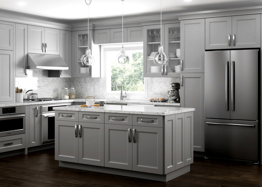
The most successful in the kitchen is the smooth flow of the light tone, in which the upper kitchen cabinets are made, into the darker colors of the lower cabinets.Kitchens with white top and gray bottom are considered a classic interior design option that helps to visually "raise" the ceiling and expand the boundaries of the room. In addition, blue, green and purple furniture can be successfully combined with gray facades. The color and design of the dining group is selected based on the selected interior design:
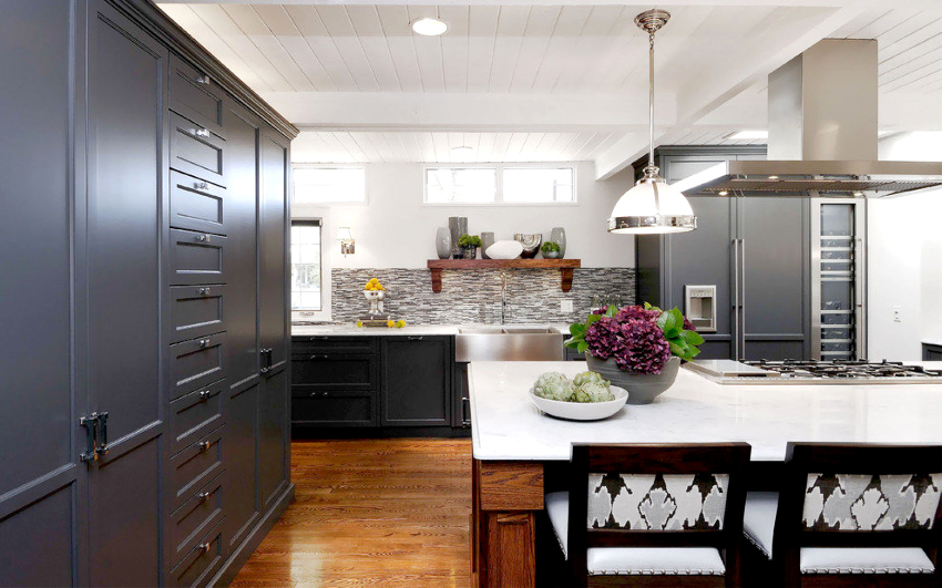
It is necessary to select material for furniture taking into account the allocated budget - both wooden facades and MDF or plastic panels look equally good
- In a classic-style room, furniture made of wood will look better.
- High-tech or loft style can be accentuated with a table with a transparent glass top mounted on chrome legs and simple gray chairs.
- For the interior of Provence, you need to purchase a table with a slightly rubbed surface, in the center of which a discreet floral arrangement will be applied.
Helpful advice! Offers good sets of gray kitchens "Ikea" - a company of Swedish origin, on the website of which sets of kitchen furniture in modern styles are available for purchase. The price of ready-made kitchens is not high, but you should be careful when choosing the right size, because the company sells only finished products.
The gray countertop in the kitchen can be combined with facades of any color. However, it is better when it is in contrast with the furniture group. In the interior, ash or granite countertops are most often found, because these colors are considered non-staining and quite practical. If you choose a countertop made of natural stone, it will make the whole interior look spectacular. Kitchens with countertops made of artificial stone or laminated MDF will look no less beautiful.
The design of an apron for a gray kitchen is selected at the last stage of finishing work, it is desirable that it does not merge with the surrounding surfaces, but stands out a little against their background. Many designers like to use a small steel shade mosaic to decorate the kitchen interior, which is mixed with squares of a different color. Gray tiles, which are used to finish the apron, look no worse in the kitchen, especially if a shade of wet asphalt is used.
In addition to creating a beautiful appearance, this tone perfectly conceals greasy stains and traces of soot. Between gray kitchen cabinets, an apron lined with brickwork or other material that imitates it will look attractive.
Features of lighting and the choice of accessories for kitchens in gray tones: photos of finished interiors
To make a straight or angular gray kitchen look more attractive, and the main color does not drown out, but, on the contrary, complements other shades, it is necessary to organize not only correct, but also sufficient lighting. If only gray color and its shades are used to decorate the room, then a large bright lamp, which is installed above the table, will dilute the monochrome interior.
Helpful advice! With the help of different types of lighting, you can correctly perform the zoning of the room. So, above the working area, bright light is used, and above the dining area, a warmer, muffled one.
LED lamps and lighting for household appliances built into the wall cabinets are used as additional light sources. In addition to performing the main function, these lamps play the role of decorative elements.
In the photo of gray kitchens, you can often see how the gray interior is diluted with extravagant decor items or bright textiles. If we are talking about a classic interior, then wooden, forged products, as well as objects made of stone and glass will complement the room.The interior pottery looks original, and you can decorate the walls with paintings and unusual panels.
You need to choose curtains for the interior taking into account the color of the walls and facades of the kitchen set. Basic designer tips for choosing textiles:
- The original finish of the gray interior with matte walls will be silver curtains, emphasizing the modern style.
- It is recommended to hang dark blue curtains near the kitchen furniture, on the facades of which there are numerous glass inserts and chrome fittings.
- Against the background of a light gray kitchen, simple ash-colored curtains look good.
- If you want to see the kitchen modern, bright and dynamic, then it is appropriate to arrange the window opening with the help of bright textiles. For this purpose, turquoise, orange, pink or aqua is suitable.
The bold interior can be complemented with other rich textile elements. For this, beautiful pillows or chair covers, pot holders and towels, as well as tablecloths are suitable. Plants in beautiful pots are another decor option. When choosing accessories, you need to adhere to restraint so as not to oversaturate the interior.
What colors are combined with gray in the interior of the kitchen
If you look at a selection of photos of kitchens in gray colors, you will notice that gray is harmoniously combined with most shades. The main thing is to adhere to certain rules:
- Do not use more than two primary colors on the fronts of the kitchen unit.
- Top cabinets should be a few shades lighter than those below.
- If a small kitchen is being made out, then you should not use excessively bright shades, even when choosing accentuating elements.
The gray and white kitchen design is considered the most classic and versatile. At the same time, there are some restrictions in use, because white, like black, is considered one of the options for gray. Successful combinations include a white kitchen with a gray countertop, which is installed between white glossy facades against a background of light gray walls. In this case, the ceiling should be left pure white, but it is advisable to install household appliances in a gray case. To dilute the laconic gray-white interior, it is appropriate to supplement the appearance of the kitchen with several bright accent details of this color:
- yellow;
- red and orange;
- brown;
- blue and turquoise;
- purple and lavender.
You can also dilute the kitchen in white and gray tones with shades of beige: powdery, cream, milk chocolate or cappuccino. With this combination, bright shades are no longer needed - deeper tones will look more attractive. A discreet kitchen in light colors always looks elegant and evokes a sense of harmony and tranquility.
For the design of a gray-beige kitchen, it is recommended to use the beige color of the facades of the kitchen set, which is complemented by beige textiles. The main background is light gray walls and a gray dining group. The flooring is gray porcelain stoneware or beige wood flooring.
A dark gray kitchen with the addition of black is considered the best solution for creating styles such as minimalism, loft, hi-tech. In this room, gray should be used as the base color, and the countertop or the lower level of kitchen cabinets can be black. Household appliances in black can be an addition to the black and gray interior.
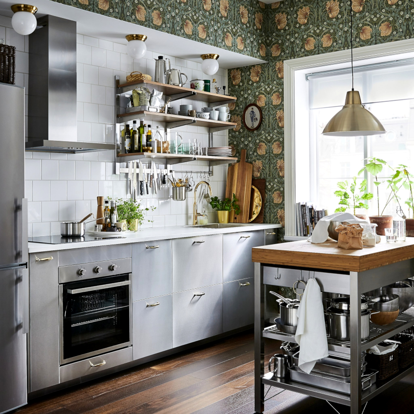
You can dilute the kitchen interior in white and gray tones with the help of beige colors: powdery, cream or cappuccino
It is interesting! The countertop made of natural stone, made in gray color, looks unusually beautiful, above which is laid out a mosaic apron with gray, black and white squares. The best solution for floor decoration in this case is a black and white checkerboard.
Attractive combinations of gray with other colors in the interior
A red and gray kitchen is a good idea for a catchy modern interior. In such a room, red is used on the facades of furniture with a glossy surface. The table top and backsplash are done in gray and white tones to set off the bright red interior. For the facades of household appliances, a silvery metallic color is suitable, the floor should be either white or gray. Instead of curtains, laconic white, as well as silver Roman or roller blinds will look better in the interior.
Taupe cuisine is not considered a popular option. However, if you use color combinations correctly, you can create an attractive and original room. As brown, its light tones are often used, such as coffee with milk, chocolate and the color of rich coffee, which are combined with an ash tint. You can create a more luxurious and glamorous interior with a few splashes of gold and pearlescent tones.
In the interior of such a kitchen, in no case should brown be the dominant color. You can use it to decorate the floor or choose a dining group, decorative elements or fittings in brown.
Woody shades such as beige, wenge are considered more popular for use in the interior. A classic interior made in this way will look expensive, but restrained. Here, a combination of gray walls is most often used, against which furniture is installed with wooden facades made of such species as oak, beech, walnut, alder. At the same time, designers are advised to leave the natural structure of the tree, which, if desired, can be varnished.
Gray combined with bright colors: photos of finished interiors
A gray-pink kitchen using bright colors will perfectly fit into the apartment of a girl who prefers glamorous and catchy things. If you want to resort to pink, but at the same time leave the interior calm and elegant, it is recommended to use pale pink discreet tones. The main features of using pink when creating various styles:
- The classic trends of shabby chic and Provence involve the use of a light gray kitchen set made of solid wood. Against this background, it is appropriate to install a white countertop, and the apron in pink.
- Modern styles are created using glossy plastic fronts in pink, with a gray backsplash in between.
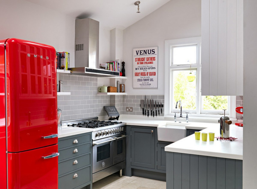
A kitchen using bright colors will perfectly fit into the apartment of a girl who prefers glamorous and catchy things
A sunny yellow color will refresh any gray interior, it will play especially well in shaded kitchens devoid of natural sunlight. The gray walls in the kitchen interior look original and bright in the photo, which are harmoniously combined with glossy facades made in yellow tones. A solid chandelier with a yellow fabric shade, installed above the dining table, will be a good addition. If a gray headset is chosen, then it is beaten with a yellow apron with a picture of flowers. The third complementary color in the gray-yellow interior can be white, which is used to decorate the countertop.
The blue-gray kitchen looks fresh and modern, but the combination of these colors requires a lot of lighting in the room to keep it from looking cold.This combination of colors is considered ideal for creating a Scandinavian interior, where gray walls are the basis, against which blue furniture is installed. The finished blue-gray interior can be done with blue curtains and a blue dining table. There are other popular color combinations.
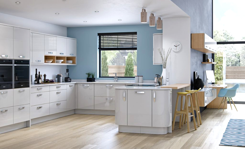
A gray-blue kitchen is considered rather cold, so it is better to choose this combination for a room located on the south side.
Gray-green. Emerald, the color of a juicy apple and a herbal shade are used as tones of green, which are combined with a smoky or steel gray tone - in this case, green is considered an accent color and is not used in excess. It is recommended to complement the kitchen interior with potted plants.
Gray-violet. Most often they use an eggplant or lavender shade, which is used to decorate kitchen facades and upholstered furniture in a room. To prevent the interior from being dark, it is required to use a large number of light sources, which are located on the walls and ceiling. It is recommended to dilute the color combination with the presence of white elements.
A gray-blue kitchen is considered quite cold, so it is better to choose this combination for a room located on the south side. When decorating, it is appropriate to use blue on the walls and when decorating the floor. The blue apron between the light gray facades visually pushes the boundaries of the room.
Various options for choosing a style: photo of kitchens in gray tones
The use of gray is more often found in modern interiors, which are considered popular among young people. Many trends involve mixing styles to create unique and individual room designs.
Gray is often used for loft-style or so-called industrial interiors, for which rough and rough surfaces are acceptable. For a loft design of a gray kitchen, it is important to use decorative plaster on the walls, and at the same time a ceramic tile covering imitating natural stone is laid on the floor. On the ceiling, metal joists or gray air ducts will look good.
High-tech style is considered to be the main trend in which the presence of gray shades prevails. Most often, there are silver, ash and light gray tones. Kitchen facades must be smooth. In this case, you need to adhere to this rule: if the walls are white, then the furniture is selected gray - and vice versa.
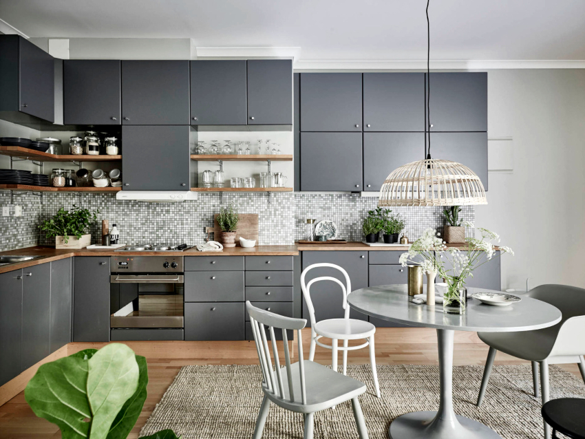
Minimalism is considered a popular modern style that gravitates towards the use of gray combinations.
It is recommended to combine gray or white kitchen fronts with glass inserts and numerous chrome fittings. It is appropriate to install a dining table with a glass top. It is also important not to use abundant decor on the walls. Furniture should have clear and straight lines.
Helpful advice! The interior of a gray high-tech kitchen will look brighter if you place a lot of artificial light sources in the room.
Another popular modern style that tends to use gray combinations is minimalism. In such an interior, it is most important to use a laconic design using gray and white colors. The main thing is to fill the kitchen interior with functional elements, for which a spacious white ceramic sink and a large number of built-in fittings are suitable. Furniture shouldn't take up a lot of space, and decor doesn't need to be applied at all. Other areas using gray for kitchen decoration:
- Safari. Gray is combined here with natural shades such as marsh or moss. There should be a lot of unusual indoor plants in the kitchen.
- Provence.The kitchen is created mainly with a gray finish, against which the aged fronts of the kitchen furniture in lavender color stand out. The interior is complemented by curtains and textiles with floral prints in the color of the kitchen furniture.
- Modern. Suitable for a spacious room in which glossy furniture with a concave or convex shape is installed. Bronze fittings are used to decorate the facades. The role of the dining table is played by the bar counter.
- Eclecticism. A direction that involves mixing different style solutions. In this case, the gray background looks beneficial and neutral. The main thing is to correctly combine ethnic and classical styles, to combine antique and modern elements.
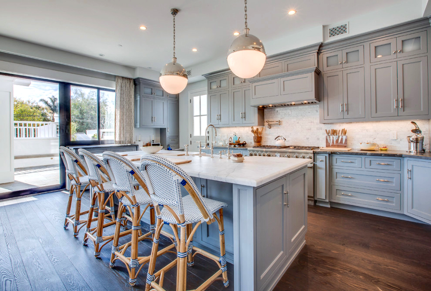
You can complement the interior of a gray kitchen in the Provence style with curtains and textiles with floral prints in the color of the furniture
How to decorate a small kitchen and adjust the shape of a room: photo of interiors in gray
The gray color in the interior of a small kitchen is used to visually expand the room, which is especially important when decorating a kitchen in a small Khrushchev or smart apartment, where no more than 6-7 squares are allocated for a given room. In this situation, you need to use light shades of gray for wall decoration, with which facades with a wood-like texture and flooring that imitate light natural stone will organically be combined.
To prevent a small kitchen from looking limited and constrained, it is recommended to use an abundance of glossy facades and glass surfaces. For example, it will complement, but will not load the room with a small corner table with a transparent tempered glass top on a white base. At the same time, laconic gray chairs with simple chrome or transparent backs are placed around the table. If it is not possible to install a separate table, then a bar counter or a window sill is used.
If the room has a low ceiling, then a vertical white stripe on the gray walls, which is completed by a white ceiling, will visually increase the height of the kitchen. For visual expansion of the walls, a horizontal strip is used against a smoky background. In this case, the color of the strip is determined based on the chosen companion color in the gray kitchen. Other ways to simulate a gray kitchen design:
- The elongated shape of the room can be easily corrected by applying luscious shades of gray for the side walls and a lighter tone for other opposing surfaces. If, on the contrary, it is required to remove the walls in a small kitchen, then the opposite option is used.
- If the kitchen is small, but has high ceilings, then they need to be "lowered", for this a vertical contrast is used: dark tones are selected for the upper facades, and the bottom, on the contrary, is made lighter. If you install a complex plasterboard structure on the ceiling, then it will actually drop by 10-20 cm.
- Mounting a compact wall-mounted headset without legs will add a little space to even the smallest room.
- With the help of ashy color, you can give the room the correct shape, rationally distribute lighting and place accents.
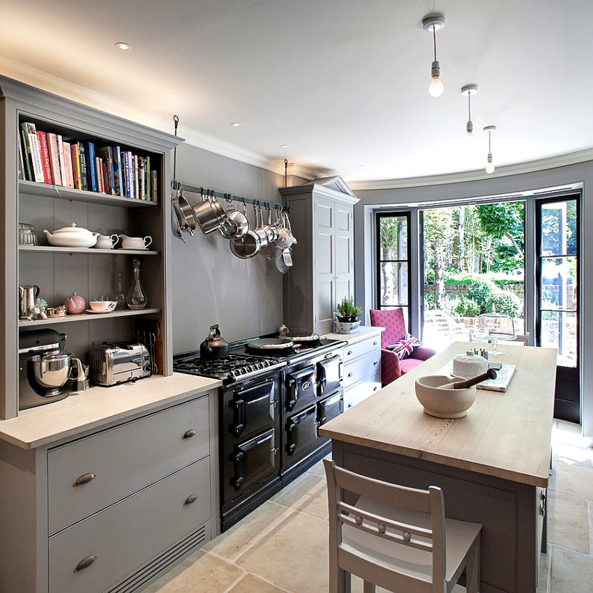
With the help of an ash color, you can give the room the correct shape, rationally distribute lighting and place accents
To expand the boundaries of any small room, you can use abundant lighting. The fewer shaded areas in a room, the more spacious it appears.
Helpful advice! You can add space to a small gray kitchen by installing spotlights on the floor, which create a sense of airiness.
With the advent of modern styles, gray is gaining more and more relevance for the decoration of rooms, including kitchens. Designers no longer consider this color to be dull and gloomy, but, on the contrary, consider shades of gray to be the ideal basis for creating any interior.An unusual design of kitchen furniture can be distinguished against a gray background and the use of ultra-modern technology can be emphasized. The main advantage of gray is the ability to combine with any other color scheme. Therefore, whichever companion color is chosen for shades of gray, the kitchen will look attractive.
